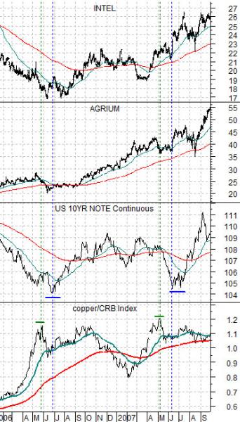
Immediately below is a chart comparison between, from bottom to top, the ratio between copper futures and the CRB Index, the U.S. 10-year T-Note futures, the share price of Agrium (AGU), and the share price of Intel (INTC).
We have argued on occasion that one of the markets ‘details’ that we are fixating on relates to the ratio of copper to the CRB Index. In other words the relative strength of copper prices to general commodity prices.
The broad argument is that as long as the copper/CRB Index ratio is strong and rising it describes a particular kind of markets trend- one that focuses quite intently on the base metals and construction spending.
While the copper/CRB Index ratio can rise for a considerable length of time but eventually it will reach a peak. A strong ratio will tend to go with falling bond prices so this will also mark a low point for the bond market.
The chart shows that the copper/CRB Index ratio made two peaks in 2006 and 2007 followed by roughly one month of bond price weakness. In other words in these two instances the bond market did not reach bottom until a number of weeks after the relative strength highs for copper prices.
Another argument that we have made with regard to the copper/CRB Index ratio is that when it stops rising the markets tend to rotate into other themes. If the dollar is weak the focus will move on to the agriculture sectors (i.e. grains prices) but if the dollar is stronger the shift will be more towards ‘tech’.
While we generally show macro themes on this page the chart detail that we are looking at today has to do with how the share prices of Intel (tech) and Agrium (grains) responded following the two tops set by the copper/CRB Index ratio in 2006- 2007.
Notice that the share prices remained somewhat under pressure until the bond market reached a price bottom. While the peak for the copper/CRB Index ratio signaled a trend shift within the equity markets the start of actual strength did not show up until long-term interest rates had reached a peak and had begun to decline. In both 2006 and 2007 the highs for the copper/CRB Index ratio were reached in May while the bond market made its lows in June. Something to keep in mind during the weeks to come.

Equity/Bond Markets
The chart below compares the U.S. 30-year T-Bond futures with the ratio between crude oil and natural gas futures.
In general a strong crude oil/natural gas ratio goes with falling bond prices. It also tends to reflect Asian or BRIC economic strength. Natural gas is more closely linked to U.S. industrial production while crude oil tends to trade with emerging markets momentum.
The argument has been that an oil/gas ratio above 20:1 is sufficiently ‘high’ to mark a bond market bottom. Such was the case in 1990 and again in the late summer of 2009. As we understand it the energy equivalent ratio is around 6:1 so the longer the ratio remains substantially above this level the greater the incentive to find ways to substitute natural gas for crude oil.
We have noted on a few occasions in the past that the equity markets are trading as if natural gas prices are going much higher. This raises the question about which camp is correct- the fundamental analysts who believe that gas prices will remain low for years or the market itself.
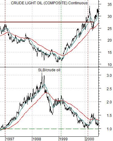
Further below we show crude oil futures and the ratio between Schlumberger (SLB) and crude oil from late 1996 into 2000. The point is that the ‘oil stocks versus oil prices’ (SLB/crude oil) ballooned into 1998 which was the markets’ way of saying that oil prices below 27 were ‘temporary’.
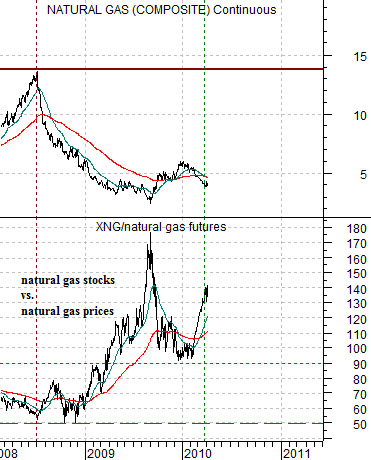
The chart below compares natural gas futures with the ratio between the Natural Gas Index (XNG) and natural gas prices. Notice that the ratio is behaving in a manner very similar to the SLB/crude oil ratio. Is it possible that the next times gas prices rise above the moving average lines that the rally won’t end until gas has moved back closer to 15?


