When we get our teeth into a topic we tend to stick with it for a few days so we are going to start off today by taking another run at the ‘decade theme’.
The idea is that the markets have shifted major themes each decade. Through the 1970’s the trend favored raw materials prices while during the decade of the 1980’s the trend shifted to include financial asset prices and the consumer sector leading to a blow off or bubble in Japan. During the 1990’s the trend changed in favor of large cap U.S. stocks with an emphasis on tech and telecom only to morph back into a commodity-oriented theme through the first ten years of the new millennium.
To the extent that the trend shifts have moved from commodities to Japan to U.S. large caps and back to commodities… our argument has been that the relative strength winner for the current decade may well be Japan once again. Time will tell.
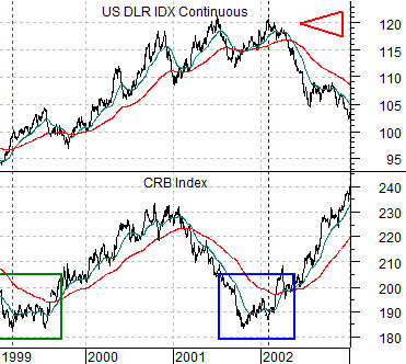
The chart below compares the CRB Index and the U.S. Dollar Index futures from 1999 through 2002.
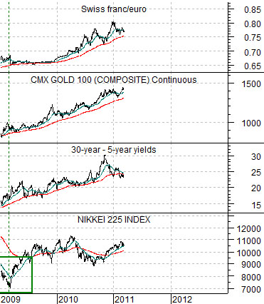
The next chart shows the Nikkei 225 Index, spread between 30-year and 5-year U.S. Treasury yields, gold futures, and cross rate between the Swiss franc and euro from 2009 to the present day.
The argument is that while the trend for the CRB Index turned positive in early 1999 it didn’t start to gain real traction until the U.S. dollar finally started to weaken in early 2002. After rallying nicely through 2000 the CRB Index slumped back to the lows on dollar strength during 2001 only to swing upwards with a vengeance in 2002 well ahead of the cycle lows for the equity markets.
If the bottom for the Nikkei in 2009 was similar to the lows for the CRB Index in 1999 then we are faced with yet another two-handed dilemma. On the one hand the trend should now be positive while on the other hand the ‘offsetting negatives’ have yet to turn clearly lower. Our view is that the ‘offsetting negatives’ include the yield spread, gold prices, and currency trends based on strength in the Swiss franc versus the euro, British pound, and dollar. Until the negatives stop weighing on the trend the potential for a lower Nikkei can not be ruled out.
Equity/Bond Markets
We focused rather intently on two ‘lead-lag’ relationships through the final few months of 2010. It is time, we suspect, to come back to these arguments.
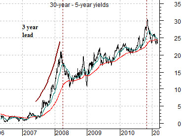
Below is a chart of the yield spread between 30-year and 5-year Treasury yields. The argument was that the yield spread was leading the equity markets by roughly three years. In other words the yield spread bottomed in 2000 with the cyclical trend making a low in 2003 and then topped in 2003 with the cyclical trend (copper and Japan) peaking in 2006. And so on.
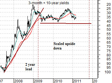
At middle we show an upside down view of the sum of 3-month and 10-year Treasury yields. We have scaled the chart in this manner so that the trend goes with the cyclical trend instead of in the opposite direction.
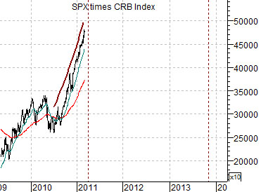
Next is a chart of the S&P 500 Index times the CRB Index. We are using the combination of equities and commodities to represent the cyclical trend.
Now… the key here is that the charts have all been shifted or offset. The spread between 30-year and 5-year yields begins in 2006 while the upside chart of 3-month and 10-year yields starts in 2007. The combination of equities and commodities, on the other hand, begins in 2009.
We are attempting to show that the trend for the yield spread in 2006 and 2007 was impacting the trend for equities and commodities in 2009 and 2010. As well the upside down trend for yields in 2007 and 2008 was driving the cyclical trend in 2009 and 2010.
The charts make an interesting case. The combination of a parabolic rise in the yield spread in 2007 and sharply declining interest rates through 2008 was expected to drive the cyclical trend strongly upwards through 2010. Our argument last year was that we expected to see almost relentless growth through the final quarter of 2010.
If we take the charts literally the cyclical trend should remain strong through the first quarter of 2011. The yield spread did not reach its first peak until March of 2007 and the trend for the sum of short and long-term yields did not break the rising support line until the spring of 2009.
So… now what?
For all intents and purposes the cyclical trend’s strength should ease somewhat as we push into the second quarter of this year. This may help to explain the price pressures that have been felt this week in the basic materials sectors. The trend may not be turning negative any time soon but its raw… positiveness… should start to cool.
On the good news side of the equation the trend is not expected to turn truly bearish until, at the earliest, the autumn of 2012. This is based on the upside-down peak for the sum of short and long-term yields in the third quarter of 2010. If we take a reading off of the yield spread then something closer to the final quarter of 2013 appears more likely. The bottom line is that we are moving out of the momentum ‘blast’ that has helped power asset prices through the first quarter of this year but should hold an underlying positive trend for the foreseeable future.