We usually start off with a macro or long-term perspective but given that the end of the quarter is fast approaching we thought we would focus on something with a bit of shorter-term relevance. Keep in mind that today’s topic has to do with a ‘tendency’ that the markets display from time to time. There are lots of situations where this hasn’t and won’t work but… it is likely worth keeping in mind all the same.
One of our views is that trends tend to run quarter to quarter. Another view is that the pivots or turning points often swing around the end of the first month of a new quarter.
The argument is that there is a period of a few weeks at the beginning of a new quarter when the markets are looking ‘backwards’. In other words traders are focusing on the expectations for earnings from the previous quarter. This brings into play two different factors- the actual earnings and the reaction to those earnings.
We have all seen stocks rise on disappointing earnings and fall on better than expected numbers. This relates, in a sense, to the amount of speculation built into prices and some of that fervor shows up in the way the equity markets trend through the first few weeks of the new quarter.
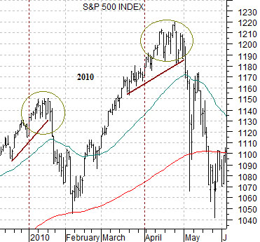
At top right is a chart of the S&P 500 Index (SPX) from 2010. Notice that the index rose through the first few weeks of both January and April as earnings were being released before tumbling lower into both February and March. The SPX was trending quarter-to-quarter with peaks spaced three months apart even though each peak was followed by a sharp sell off as speculative optimism was wrung out of the markets.
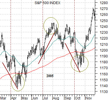
Below right is a chart of the SPX from 2005. The index sold off into April and October as investors awaited earnings news with sense of gloom and pessimism while in July the index drove higher through the announcements only to pivot back to the down side. Once again the extremes were set three months apart with the pivots occurring late in the first month of a new quarter.
The points? First, through the first few weeks of April the markets will be focusing on last quarter’s results. By month end the focus will shift to the current quarter’s business. Second, we are often more inclined towards a positive view when the equity markets are weak at the start of a quarter while we tend to be more nervous about a market that drives upward in anticipation of earnings.
Equity/Bond Markets
We are going to attempt to tie in a number of separate points into one argument today as we focus on the share price of Coca Cola (KO), the way it tends to trade with respect to the direction of yields, and the way it relates to the ‘laggard banks’ trend represented by Japan’s Mitsubishi UFJ (MTU).
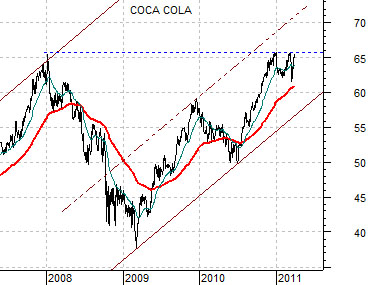
The first point is that Coke is ‘stuck’. It may not remain stuck but it is certainly well and truly stuck for the time being.
The chart below shows the share price of KO. The stock reached a peak of around 66 at the end of 2007 before rising back up to 66 to end off 2010. It has since sold off a couple of times to the rising 50-day e.m.a. line and is at present crowding resistance once again.
The second point is that stocks that find support at the rising 50-day e.m.a. line tend to be very strong. Notice that KO held this line in both 2007 and 2009 when it was trending to the upside and then failed repeatedly at or near this moving average when it was trending lower in 2008 and the first half of 2010.
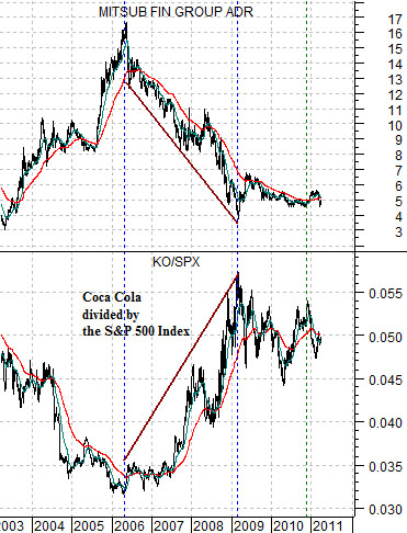
The third point can be seen through the chart at top right. This chart compares the share price of MTU with the ratio between KO and the S&P 500 Index (KO/SPX).
The argument is that MTU has tended to trend higher during those periods of time when the KO/SPX ratio was falling. The absolute peak for MTU in the spring of 2006 was reached at the low point for the KO/SPX ratio while the bottom for MTU in March of 2009 was made when the ratio rose to a top.
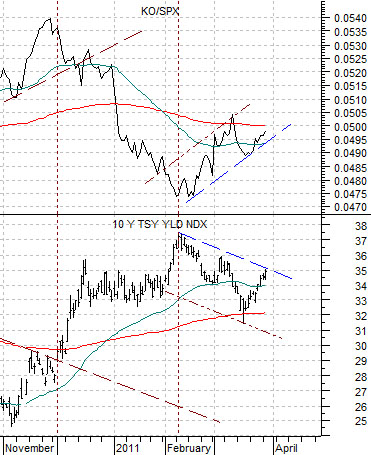
The final point is featured below right using the chart of the KO/SPX ratio and 10-year Treasury yields.
A rising KO/SPX ratio represents a trend within the markets that tends to go with falling long-term yields. Strangely enough the KO/SPX ratio began to rise in mid-February when crude oil prices spiked to the upside suggesting that strong energy prices or, perhaps, the rolling sense of crisis in the Middle East and North Africa that may have been responsible for stronger energy prices is tied in with falling yields, a shift towards relative strength for KO, and downward pressure on the laggard banks. Our sense was that a return to a better trend for MTU should line up with both rising yields and a weaker KO/SPX ratio.