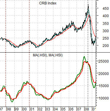
When we have presented and used a chart-based argument on numerous occasions it makes sense to check back in with it from time to time. Such is the case today as we start off with a chart comparison between the CRB Index and the Hang Seng Index from 1997 into 2009.
The Hang Seng Index has been reduced to two moving average lines- the 100-day e.m.a. in green and the 200-day e.m.a. in red. The selection of these two particular moving average lines is somewhat arbitrary and is the end result of considerable ‘fiddling’ with the chart over the years.
The argument is that there is a basic relationship between the Hong Kong stock market (representing Asian growth) and commodity prices (driven by Asian growth). Since the financial markets tend to lead the real world perhaps it isn’t too big of a leap to argue that the Hang Seng Index leads the CRB Index.
The premise behind the comparison is that the end of a rising trend for the CRB Index appears to line up with the ‘crossing’ of the 100-day e.m.a. line down through the 200-day e.m.a. line. The moving average lines ‘crossed’ on three occasions from the mid-1990’s through the previous decade (1997, 2000, and 2008) and in each case the trend for commodity prices concurrently turned bearish. So… coincidental or not… it has a reasonable success rate.
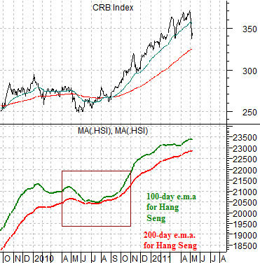
Below is the same chart comparison for the current time period. Notice that the moving average lines converged during the second half of 2010 only to widen out once again as the Hang Seng Index pushed upwards.
The points are that in the post-2008 time frame the only time that the recovery was really in doubt was the late summer of last year. At present the Hang Seng Index is still far enough above its moving average lines to suggest that the CRB Index can correct, consolidate, or even tumble but it isn’t likely on the verge of turning into a long-term bearish trend. For that to happen we would expect to see the Hang Seng Index (last seen around 23,336) lead to the down side by breaking and holding well below 23,000.
Equity/Bond Markets
Our above point was that the current position of the Hang Seng Index continues to support a rising commodity price trend. If history were to repeat this market should decline well in advance of the cycle peak for the CRB Index.
So… let’s put this into some form of perspective using the ratio between the share price of Johnson and Johnson (JNJ) and the S&P 500 Index (SPX).
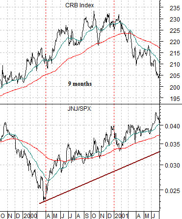
Below is a chart of the JNJ/SPX ratio and the CRB Index from 1999- 2001. The chart shows that the JNJ/SPX ratio began to rise around 9 months ahead of weakness in the CRB Index.
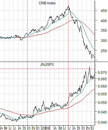
Next is the same chart from 2007 through 2008. This chart shows that the JNJ/SPX ratio turned higher roughly 9 to 12 months ahead of the top for commodity prices at the end of June in 2008.
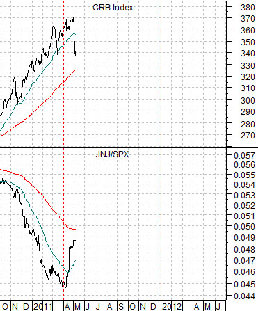
Lastly we have included the current situation.
If we assume that credit tightening and inflation fighting in China is slowing growth and that the markets will response to slowing growth by selling the Asian share markets lower… then a case can be made that the Hang Seng Index will ultimately decline below 23,000 and in due course the moving average lines will ‘cross’ marking the final top for the CRB Index.
The two charts at below suggest that one of the things that tends to happen as much as 9 to 12 months ahead of the cyclical peak is an upswing in the JNJ/SPX ratio. Given that this ratio began to rise at the end of the first quarter this year… the charts suggest that we could still see stubborn strength in energy and base metals prices through the balance of this year.