The markets remain rather firmly split between the momentum-following trend runners who view the bullish action in financial asset prices as a sign that real economic activity will accelerate into 2010 and the old-style fundamentalists who still fear a post-1929 outcome. Both can make rather compelling arguments although, for the time being, the bulls are undoubtedly enjoying life just a bit more these days.
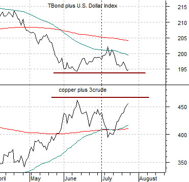
Below we show a chart comparison between the sum of the U.S. 30-year T-Bond futures and the U.S. Dollar Index (DXY) and the combination of copper futures prices (in cents) and crude oil futures (in dollars multiplied by three times).
The argument today is that the markets have reached yet another decision point. When the dollar and bond market are declining the trend for energy and metals prices tends to be stronger and when the dollar and bond market begin to lift then the trend for energy and metals prices turns lower.
The chart suggests that the markets are either working through a consolidation following the peak for copper and crude oil prices in early June concurrent with the low point for the dollar and bond market or… a trend change is in the making. If the sum of copper and crude oil pushes on to new highs and the dollar and bond market falls to new lows then the trend-riding bulls will enjoy a few more months of profits. If, on the other hand, both sides of the equation fail to break through the June extremes then by the end of this week we would expect to see clear indications of a trend reversal complete with a better dollar and Treasury market in the face of weaker commodity prices.
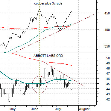
Below right we feature the comparison between copper and crude oil futures and the share price of Abbott Labs (ABT).
The argument several months ago was that if ABT pushed above its 50-day e.m.a. line it should mark the peak for copper and crude oil futures prices. The relationship worked rather nicely through the back half of June but over the past few weeks ABT has softened somewhat as energy and metals prices have firmed. The chart-based argument would be that if ABT resolves back above 46 this week then the ‘trend change’ outcome appears more likely but if it grinds back down towards 42- 43 then the commodity trend remains alive and well.
Equity/Bond Markets
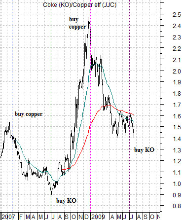
Below we show the ratio between the share price of Coca Cola (KO) and the copper etf (JJC).
We argued several years back that based on the lag between interest rates and commodity prices we expected the trend for the commodity markets to turn negative around the spring of 2006. To this day we still have a hard time explaining what happened from late 2007 into mid-2008 although, if pressed, we can usually come up with an suggestion or three.
In any event… from 2006 into 2009 the markets have followed a very similar pattern. The first half of the year has featured a very strong cyclical trend and rising long-term interest rates while the second half of the year has included falling long-term yields along with an assortment of catch-up trends in other markets.
The KO/JJC ratio does a very nice job of showing what we mean. From roughly January through June the ratio has declined as copper prices have outperformed Coca Cola while from July through December the ratio has risen as Coke has outperformed copper.
What intrigues us about this ratio at present is that being long Coke and short copper today seems as insane as being long copper and short Coke six months ago. It is as hard today to fade the China/commodity/rising interest rate trend as it was to buy it at the start of the year. Given that the hardest trades often turn out to be the best trades… we admit that this simple ratio has really captured our attention this month.
Obviously this time could be different and given that this is truly one of the most extraordinary time periods in markets and economic history we simply can not argue that what happened over the past few years has to repeat.
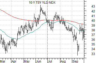
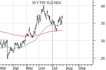
Still… we remain captivated by thoughts of what it could or would mean if the pattern persisted through the balance of the year. To help move this from broad and theoretical concept to an ‘oh my goodness we can see what you mean’ kind of reality we have included two charts of the yield index for 10-year U.S. Treasuries at bottom right. The top chart is from 2008 while the lower chart is from 2009.
Taking just the March into July time periods for both charts into consideration one would be hard pressed to differentiate the trends over the last two years. Yields bottomed around mid-March, rose to a peak into the mid-June, and sold off into early July. Yields then staged a rally through into late July which is where things stand as a new week begins.
One can argue that this year’s outcome will be different than last year’s and that makes perfect sense. Falling yields are a positive for the equity markets some years and a negative in other years. The problem is that every single trading position taken by those funds and investors who attempt to ride the tail wind of momentum is based on the intermarket assumption that we will see new highs for long- term Treasury yields. That was exactly the point that we were attempting to make on today’s first page. If yields resolve back to the down side as we wrap up the balance of the month then there is a strong possibility that the Coke/copper ratio- which represents the broader theme of defensive versus commodity cyclical- is going to pivot back to the upside through into year end.