We have been arguing for some time that we expect the strong cyclical trend to persist through the fourth quarter and so far that has turned out to be reasonably accurate. While the reaction after the close yesterday to an assortment of earnings releases appeared to calm the markets after a bumpy session each time we see the share prices of the major banks drop by 4% to 5% we admit to a bit of unease. When this is coupled with yet another new high for gold prices… we can’t help but wonder whether ‘through the fourth quarter’ might be somewhat optimistic.
In hind sight the markets always seem to make sense but in real time it is often difficult to see the forest for the trees. When a trend changes or a market starts to behave in an odd and unexpected manner the ramifications are often less than obvious. Such was the case, we suspect, back in 2000 so that will be our jumping off point for today.
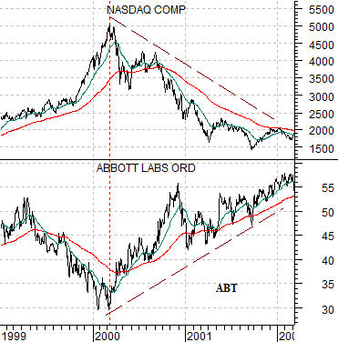
Below is a chart of the Nasdaq Composite Index and the share price of Abbott Labs (ABT) from 1999 into early 2002.
We are going to continue with our point on the next page but the argument is that ‘something changed’ in March of 2000. The Nasdaq stopped rising and the share prices that had been under pressure as the Nasdaq roared higher… stopped falling and started to lift. Yet the trend shift was hidden by a number of factors. First, while interest rates were falling the declines made no apparent sense. We would find out late in 2000 exactly WHY yields were moving lower but through the second quarter most investors were busy trying to scoop up tech bargains. Second, energy and base metals prices were still making new highs. This was hardly the back drop for lower interest rates and relative strength in defensive names such as Abbott Labs.
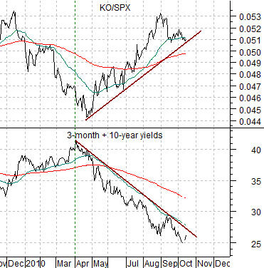
Further below is a chart of the sum of 3-month and 10-year Treasury yields along with the ratio between the share price of Coca Cola (KO) and the S&P 500 Index (SPX).
In 2000 the Nasdaq reached a peak around the end of the first quarter leading to a rising trend for ABT that would run for close to 2 years. In 2010 we find that yields began to decline around the end of the first quarter and even in the midst of a very strong commodity market the share price of Coke is outperforming the broad market. Our thought was… that perhaps there is something within this comparison that we should be paying more attention to.
Equity/Bond Markets
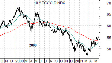
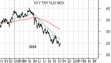
Below are two charts of 10-year Treasury yields. The first runs through 2000 while the second is from 2010.
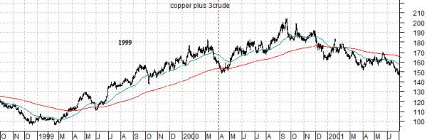
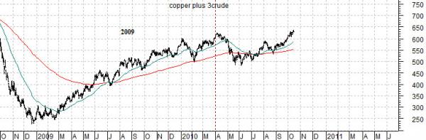
Next are two charts of the sum of copper (in cents) and crude oil (in dollars times 3). The top chart begins in the autumn of 1998 while the lower chart starts in the autumn of 2008.
On the first page we attempted to show that a large cap defensive stock such as Abbott Labs began to outperform the broad market around the end of the first quarter in 2000 while Coke started to rise on a relative basis in April of this year.
In both 2000 and 2010 long-term yields turned lower early in the year.
The charts below show that while yields turned lower in early 2000 and the Nasdaq peaked around the end of the first quarter… energy and metals prices continued to trend higher into the fourth quarter. In other words there was a period of roughly 6 to 9 months where the cycles actually ‘overlapped’. Interest rates began to decline ahead of economic weakness even as energy and metals prices made new highs based on at least the perception of economic strength.
Our point? While 2010 is much different than 2000 in many respects (most particularly the valuation levels of the U.S. large caps and the position of the U.S. dollar) the sequence of events is almost eerily similar. So similar, in fact, that we were wondering yesterday whether this was one of those things that we should be focusing our attention on over the next few weeks…