We are looking for the markets to make a cyclical bottom this month. What concerns us is that ‘the bottom’ will be some distance below current prices. That may not prove to be the case but until the bond market confirms that cyclical strength is improving by moving back to the down side there is still a risk that things will get worse before they get better.
Today’s chart presentation was most likely a result of yesterday’s decline in the Australian dollar. While we can envision a scenario that would include a decline this week in U.S. jobless claims along with supportive numbers from the U.S. employment data on Friday… we keep wondering how bad things might get if the reports disappoint. So… let’s take a run at the worst case scenario.
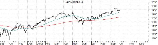
Below is a chart of the S&P 500 Index from 1987 along with a chart of the same index from 2012.
We are rather (too) fond of comparisons related to almost anything and the 1987 stock market ‘crash’ so the obvious caveat is that these kinds of events are quite rare. Yet… from a visual perspective the charts bear a certain unnerving similarity.
Put another way… the upward path taken by the SPX from the lows in the autumn of 1986 to the first correction in the second quarter of the year followed by an extension of the rally into the end of the third quarter is amazingly similar to the path that the index has followed as it recovered from the correction lows in the autumn of 2011.
The worst case? Probably a water-fall decline that knocks the last 12 months of gains off of the broad large cap market brining the S&P 500 Index back into the 1150’ish range.
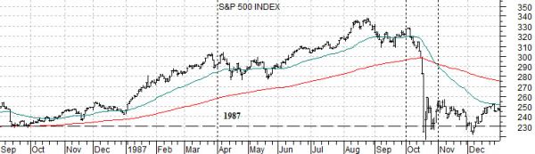
We fully admit that 2012 is not 1987. We have done far too much work on ‘why’ the stock market crashed in 1987 to be tricked into thinking that the situation is similar.
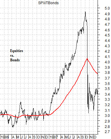
Below is a chart of the ratio from 1986-87 of the S&P 500 Index versus the U.S. 30-year T-Bond futures.
The 1987 stock market crash was, more of less, the end result of a sequence that started years in advance. As always it is difficult to know where to begin but if pressed we would probably suggest that 1984 is a good starting point.
In 1984 commodity prices began to decline. Again. The trend for the CRB Index was steadily lower from 1984 through the end of 1986. The problem was that crude oil prices refused to decline so by November of 1985 we had crude oil futures pushing back to the highs even as the broad trend for commodity prices continued to weaken.
Between late 1985 and the end of the first quarter of 1986 the price of crude oil futures declined from just under 32 down to 10.5. In other words in the space of just over a quarter the price of crude oil fell by 2/3rds.
Collapsing oil prices sent bond prices soaring but as the cyclical trend steadied and then kicked back into gear at the end of 1986 the stock market moved higher as bond prices tumbled. This created the incredible 3-quarter rise in the equity/bond ratio shown at right.
In a sense the sequence was based on a series of markets ‘crashes’ led by crude oil in late 1985, bond prices in 1987, and then stock prices later in the year.
The most obvious similarity in 2012 to the sequence into 1987 would be the lofty heights of the bond market. Weakness in Europe and then China have helped to elevate the bond market to all-time price highs. A 1987-style situation would be more appropriate if bond prices tumbled from current levels while stock prices soared in response. That is most certainly NOT the situation today.
Our thought is that the biggest risk at present is not the kind of economic strength that pushes bond prices lower but instead the associated disappointment that would go with continued bond price strength. In other words… a situation that included renewed concerns for Europe, confirmation of weakness in China, and no offsetting strength from U.S. employment.
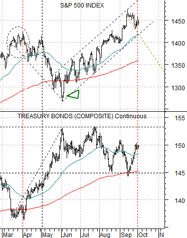
Below is our chart of the S&P 500 Index and U.S. 30-year T-Bond futures.
The argument has been that as long as the TBonds hold above the 200-day e.m.a. line (i.e. 145) and below the highs set in May and July (i.e. 153) the SPX should continue to grind higher.
Our sense is that a near-term ‘worst case’ would involve the TBonds soaring up through 153 with the SPX correcting back to or below its 200-day moving average line. This is a bit less dramatic than the picture shown on page 1 as we are looking at down side closer to 1300- 1350 instead of 1150.