

One of the most common mistakes traders make while cutting their teeth is misinterpreting bearish momentum divergences during a rising trend in price (I was no less guilty myself in the early years). Let’s look at the daily chart of the S&P 500 E-mini (ES) as an example.
The green line at the top of the chart shows a higher price high was reached in June. The red line at the bottom shows the fast relative strength index (RSI) average put in a lower peak while in an overbought condition (you’ll see the same thing in RSI without averages). This signals a bearish divergence between price and momentum, meaning there was less follow-through buying at higher prices compared with early June.
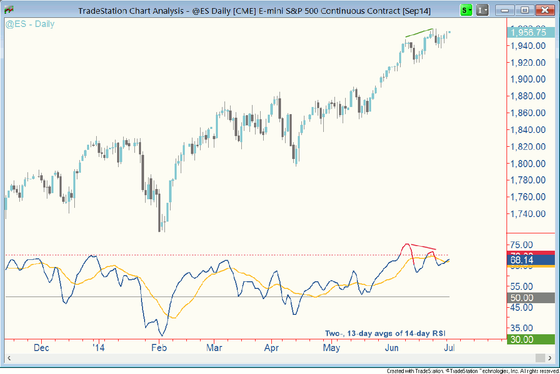
I’m not terribly concerned about this because the price structure remains bullish. Notice the dip from the 6/23 high was marginal, much smaller in magnitude than the decline from the 6/9 high. There isn’t any evidence of supply overwhelming demand. Following the steep run-up in late May and early June, it isn’t surprising to see the pace of the advance slow down as some swing traders take profits – a source of supply not at all large enough to change the tide.
I wouldn’t be surprised to see this bearish divergence undone. It’s a strong trend, one that few would be would be willing to sell short. If you’re long, stay long and keep your emotions out of the equation by setting a trailing stop based on a moving average or whatever works for you. This will keep you focused on the trend rather than on what could be little more than a little wiggle.
Good trading, everyone.

