

Technicians know that keeping an eye on “out-performing” sectors can give a birds-eye view as to the market’s direction in the longer term.
TRADITIONAL MARKET ACTION
Market leaders, such as financials, energy, materials, and technology, are expected to out-perform during market rallies and under-perform in bear markets.
Creating a ratio chart of prices between each sector of interest and a broad equity index such as the S&P 500 will show whether each sector is out-performing or under-performing. The same can be done with defensive sectors, such as healthcare, telecom, and utilities, and expect under-performance during market rallies and vice versa.
LEADING INDICATORS
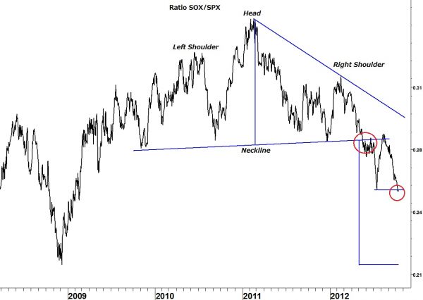
One of the best leading indicators is the ratio between the semiconductor index (SOX) and the S&P 500.
In the ratio chart of this pair below it is clear how semiconductors led the advance before the broader average bottomed in March 2009 and continued to out-perform all the way into early 2011.
The decline since then has been a sign that the bull market wouldn’t last forever but was too early for timing the turn.
KEY FINDINGS
However, using simple technical analysis gives other information which is just as interesting. The chart appears to show a bearish head-and-shoulders pattern. Measuring from the top of the ‘head’ to the ‘neckline’ provides the minimum expected decline in the ratio. In this case it calls for a return to the October lows. Interestingly, a return to the October lows is the same message given by Lindsay’s Three Peaks and a Domed House pattern for the Dow Industrials index.
= = =

