
The GOLD market is beginning to look very interesting again. For the last few years most Gold related stocks have been very poor investments and GOLD has been very lackluster. Let me quickly build a thesis for Gold.
- Oil has been one of the best assets to invest in over the past 18 months.
- The CPI just printed at 7.5% which is the highest inflation in 40 years.
- Usually when Oil does well, the gold market tends to follow suit.
- If we are in an inflationary environment, we SHOULD expect that GOLD will eventually respond positively.
But here is the reality of GOLD and Gold related stocks.
The performance of the gold sector has been poor in comparison to the broader stock market. But there are some noteworthy things to evaluate and consider.
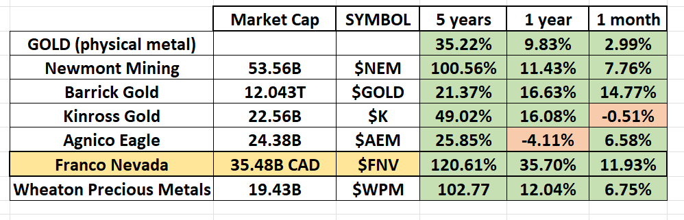
One factor that we like a great deal in a sector is that you will quickly see that on a 5-year, 1 year and 1 month basis, the performance for the most part has been positive. When a lackluster sector begins to turn almost entirely positive, we think it is time to pay attention and do a deep dive to explore where the opportunities and risks actually are.
The second factor that we find very interesting is a chart pattern that we have found to be extremely reliable over the years. Back in the 1980’s the founder of Investors Business Daily, William O’Neal researched in depth a pattern that he named the CUP and HANDLE pattern. When we study the 10-year monthly chart in Gold we see this pattern has formed on the chart which is potentially a very bullish indicator. O’Neal credited a great deal of his long term success with growth stocks to the CUP and HANDLE pattern.
- The cup and handle are a technical chart pattern that looks like a cup and handle where the cup is in the shape of a “u” and the handle has a slight downward bias. The pattern is used to study and isolate opportunities to go long the market based upon certain conditions occurring. O’Neal taught traders that when using this indicator, a trader should place a buy stop above the upper trendline of the handle.
Let’s examine this chart in the physical gold market.
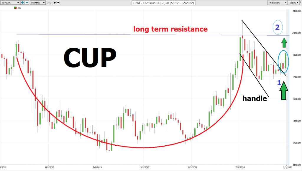
A cup and handle is considered a bullish continuation pattern and is used to identify buying opportunities. A profit target is calculated by measuring the distance between the bottom of the cup and the pattern’s breakout level and extending that amount upward from the breakout point.
The LOW in Gold occurred in December 2015 at $1220.
The Breakout of the handle at *1 occurred in December 2021 at $1830
This difference between the low in 2015 and the breakout in December 2021, of $610 is now added on to the breakout point to project an upside target of $2440.
A second potential entry point will occur at point *2 on the chart which is long term resistance. A close above $2021.30 on the weekly or monthly charts would be the highest close in Gold in 10 years and indicate that this continuation pattern is in play. The expectation would be for the market to rally into the $2400 minimum.
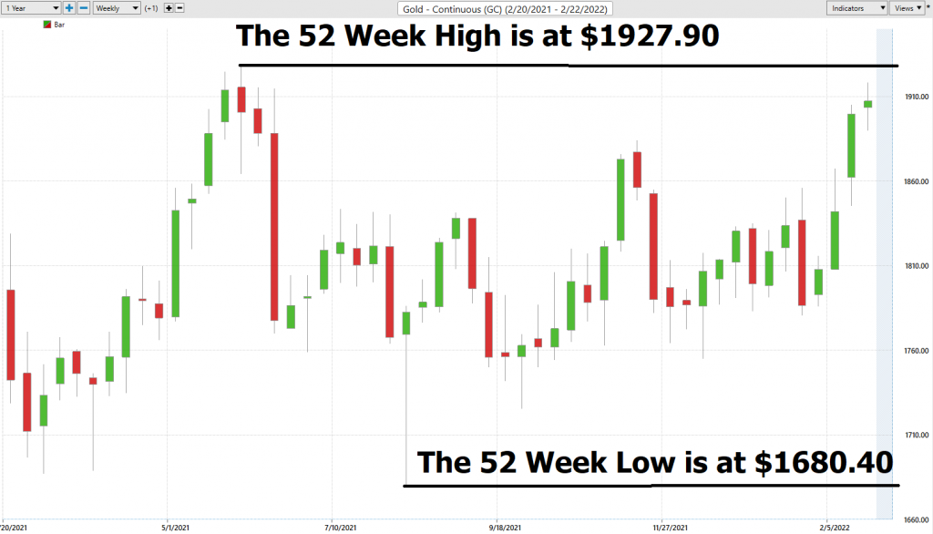
Will this occur? We need to weigh the probabilities and examine the economic narrative but what makes this an exciting trade opportunity is that GOLD is approaching its 52-week highs as well as 10-year highs. Long-time readers of this blog recognize that we consider the 52-week boundaries to be one of the most fundamental and important indicators for traders to be aware of. Traditionally the 52-week high acts as solid resistance but when it is breached that is when the fireworks occur. We think this could be setting up to be a very volatile and potentially bullish trade. It could take several weeks or months to unfold but it is worthy enough to be on your radar now and to monitor the guidance from the artificial intelligence.
For now, what we are excited about is that a solid weekly or monthly close above the 52-week high at $1927.90 will be very positive for Oil and Gold mining stocks. The probabilities favor that resistance will initially be difficult to overcome. However, when it is successfully breached PAY ATTENTION. This would indicate the GOLD the sleeping giant is awakening and the rallies in this sector will be explosive.
In this analysis we are going to do a deep dive on Franco-Nevada ($FNV)
Franco-Nevada Corporation operates as a focused royalty and stream company in the United States, Latin America, Canada, Australia, Europe, and Africa.
It operates through two distinctive segments, Mining and Energy. The company manages its portfolio with a focus on precious metals, such as gold, silver, and platinum group metals; and energy comprising oil, gas, and natural gas liquids.
The streaming business model is a fascinating one worth understanding.
The term gold streaming describes a financial transaction where a company provides cash and liquidity up front to a mining or oil and gas company. In exchange they receive the right to buy gold at reduced price, sometimes many percentage points beneath the current market price.
On the other hand, a mining company locates a plot of land, builds a mine, digs up the gold, and sells it. It’s a business that frequently alternates between feast and famine and is very much tied to the fortunes of the underlying commodity.
Streaming companies like Franco Nevada ($FNV) don’t get their finger dirty running mines. They provide the cash to mines and drilling companies. They make deals to finance and receive the underlying commodity in exchange. In an inflationary environment $FNV is positioned amazingly well. They win on the oil segment of their business and with higher gold prices they increase their margins again.
$FNV uses short-term debt, such as bank loans, to cover the initial expense of a streaming deal. They then sell debt or issue stock to permanently finance the deals.
They are debt free.
Earnings are forecasted to grow 2.3% per year for the next few years.
Earnings grew by 162.4% over the past year.
$FNV pays a .86% dividend.
Franco-Nevada released Q3 results in early November. Despite a decline in the average price of gold, the company increased revenue to $316.3 million, up 13% year-over-year (YOY).
Industry analysts love that FNV has exposure to exploration upside without any real risks related to exploration. The company boasts a diversified portfolio with agreements on 325 mining properties.
In this weekly stock study, we will look at and analyze the following indicators and metrics as are our guidelines which dictate our behavior in deciding whether to buy, sell, or stand aside on a particular stock.
- 52-week high and low boundaries
- Wall Street Analysts Targets
- Best Case-Worst Case Analysis
- Vantagepoint A.I. Forecast (Predictive Blue Line)
- Neural Network Forecast
- Daily Range Forecast
- Intermarket Analysis
- Our trading suggestion
We don’t base our trading decisions on things like earnings or fundamental cash flow valuations. However, we do look at them to better understand the financial landscape that a company is operating under.
52-week High-Low Chart
Readers of this blog will attest to the fact that we are huge believers in monitoring where a stock is trading in relation to its 52-week range. Our perspective is that winners continuously make new 52-week highs, and we want to be on board for those types of moves. We pay a great deal of attention to how a stock reacts and performs in relation to its 52-week high and low boundaries.
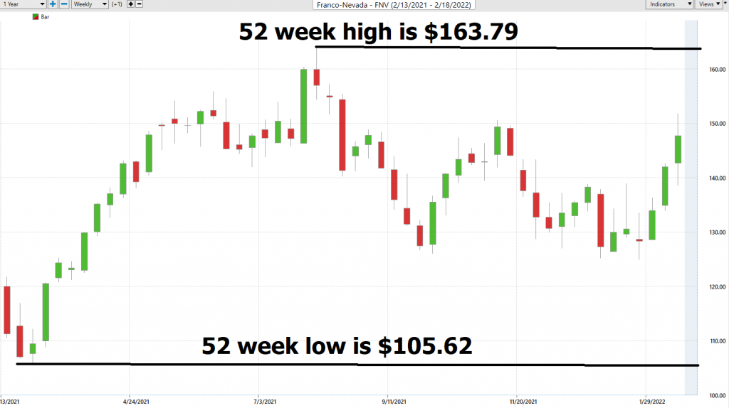
Over the last 52 weeks $FNV has traded as high as 163.79 and as low as 105.62.
Based upon the high and low prices we can quickly see that the annual trading range of $FNV has been $58.17. This tells us that the average weekly trading range is roughly $1.11.
What we often like to do as well is to divide the annual trading range ($58.17) by the current price ($145.14) this gives us a very basic estimate of annualized volatility. Current annualized volatility is 40%. This metric essentially tells us that in one year, we can expect $FNV to be trading 40% higher of lower from current levels based upon this level of volatility.
We refer to these as the commonsense metrics which we use as baseline measurements of understanding normal value. When using artificial intelligence, we look to amplify our returns based upon these baseline measurements.
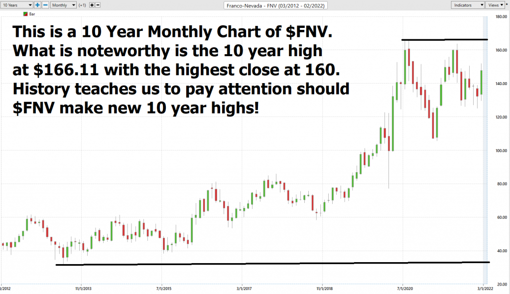
The chart below is a ten-year monthly chart of $FNV This chart gives us a very good longer-term perspective of the longer-term trend.
What we like about this situation:
The chart pattern on the longer-term charts looks very positive.
A new 10 year high will occur if GOLD and the CUP and Handle pattern unfold as discussed.
In an inflationary environment this should bode extremely well for $FNV.
Wall Street Analyst Ratings
Based on 10 Wall Street analysts offering 12-month price targets for Franco-Nevada in the last 3 months. The average price target is $149.83 with a high forecast of $188.47 and a low forecast of $110.00. The average price target represents a 3.08% change from the last price of $145.36.
At present time $FNV is fairly valued according to top Wall Street Analysts.
Best Case – Worst Case Scenarios
Next, we want to look at the trend over the past year and evaluate the strength of the rallies in relation to the declines.
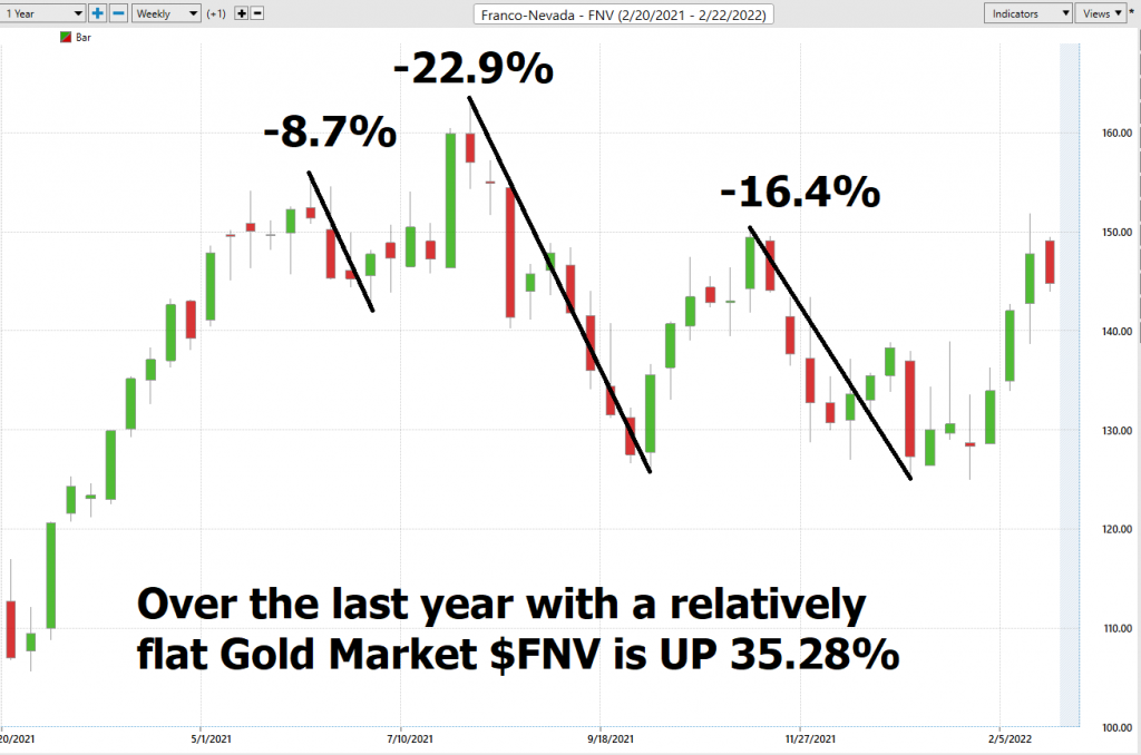
Over the past year:
$FNV over the last 52 weeks is UP 35%.
Gold the physical metal is up 9%
The DOW Jones is Up 6.59%.
S&P 500 Index +11%
NASDAQ +21.8%
Russell 1000 Stock Index is up + 8.8%%
What can we learn from these metrics?
$FNV has massively outperformed the broader stock market indexes in a marginal GOLD market.
$FNV’s exposure to oil and gas has created great returns. Chances are if GOLD moves higher so will the margins and the gains should continue.
The Vantagepoint A.I. Analysis
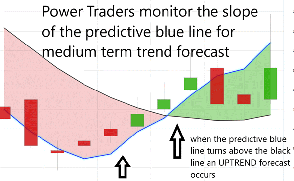
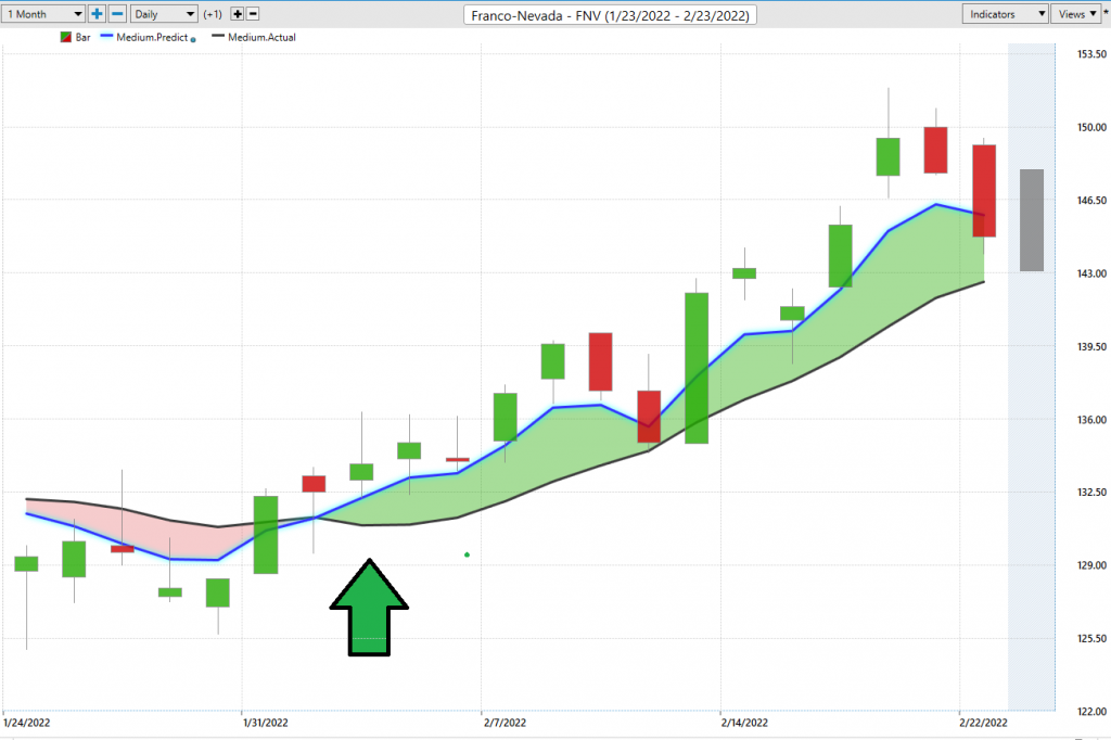
Using VantagePoint Software and the artificial intelligence, traders are alerted to trend forecasts by monitoring the slope of the predictive blue line. The black line is a simple 10 day moving average of price which simply tells you what has occurred in the market. The predictive blue line also acts as value zone where in uptrends traders try to purchase the asset at or below the blue line.
In studying the chart below pay close attention to the slope of the blue line. Anytime the blue line crosses the zero intercept is a trend signal. If the line crosses from down to up, an UP-trading opportunity exists. If the line crosses from Up to down the down trading opportunity exists.
The most recent UP forecast on 2/1/22 occurred at a price of $132.49.
Power traders use the predictive blue line in helping to determine both the value zone as well as the trend direction.
Observe how the SLOPE of the predictive blue line started moving higher a few days before its moving above the black line. A very strong trend was evidenced by seeing that price was consistently closing above the predictive blue line. Price has rallied 9.2% in the last 15 days since the UP forecast occurred.
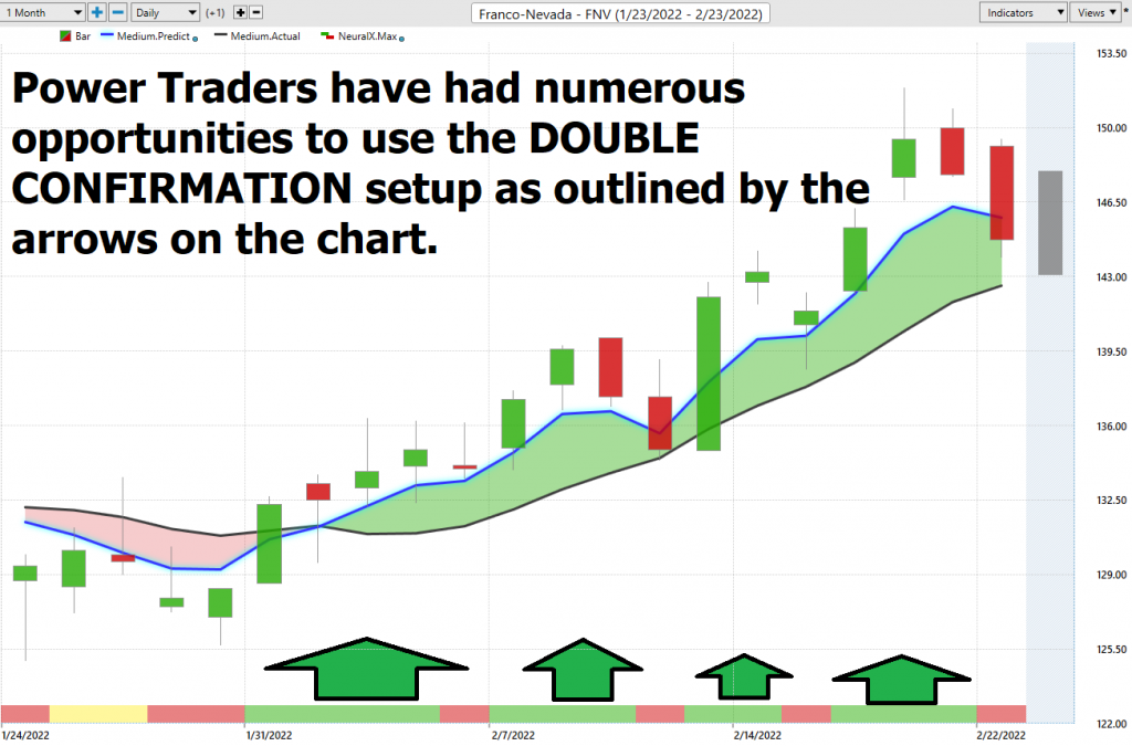
Fine Tuning Entries with The Neural Net Indicator
At the bottom of the chart is the Neural Network Indicator which predicts future strength and/or weakness in the market with a 48-to-72-hour time horizon.
A Neural Net is a computational learning system that uses a network of functions to understand and translate massive amounts of data into a desired output, consistently monitoring itself and improving its performance.
When the Neural Net Indicator is green it communicates strength. When the Neural Net is Red it is forecasting short-term weakness in the market.
We advocate that Power Traders cross-reference the chart with the predictive blue line and neural network indicator to create optimal entry and exit points. This provides what we refer to as the DOUBLE CONFIRMATION setup.
Power Traders are always looking to apply both the neural network and a.i. to the markets to find statistically sound trading opportunities.
We advise Power Traders to cross-reference the predictive blue line with the Neural Net for the best entry opportunities. Observe how by simply waiting for the green Neural Net to align with the predictive blue line the trading opportunity unfolded beautifully.
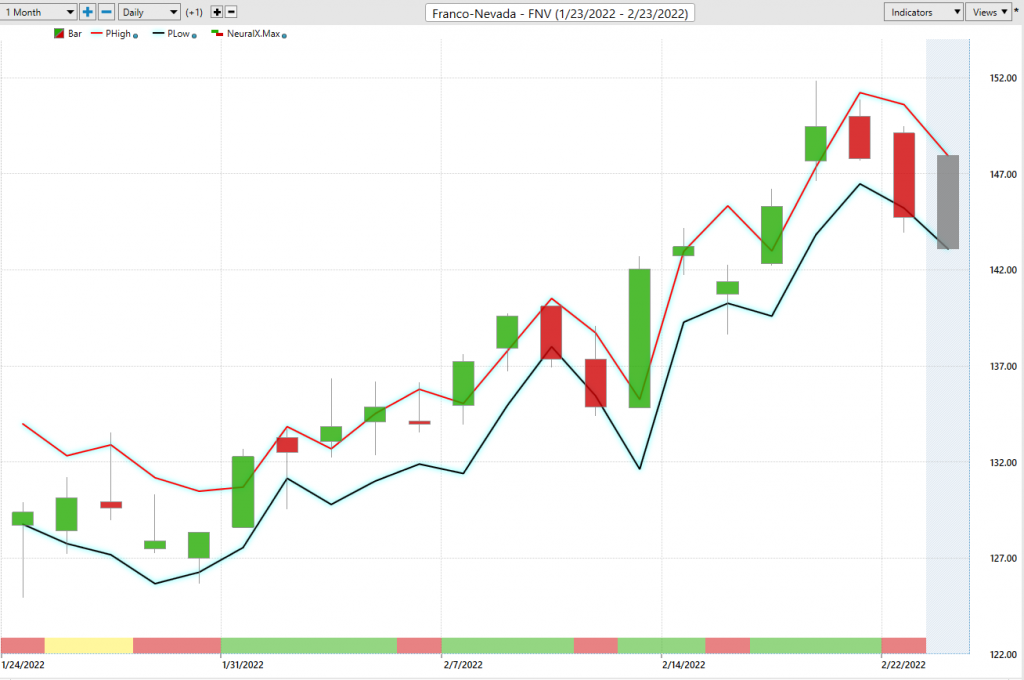
VantagePoint Software Daily Price Range Prediction
The purpose of all these indicators so far is to help traders stay on the right side of the right trend at the right time.
One of the powerful features in the Vantagepoint A.I. Software which Power Traders use daily is the Daily Price Range prediction forecast.
This forecast is what permits Power Traders to truly fine tune their entries and exits into the market often looking for smaller time frames and more granular trading opportunities.
Here is the price chart of $FNV during the most recent runup featuring the Daily Price Range forecast and the Neural Net Indicator.
All of the tools so far in this analysis attempt to define value and to clearly identify the trend and points within the trend where traders should look to capitalize on.
The expectations for each trading day are clearly defined.
Intermarket Analysis
What makes the Vantagepoint Software truly unique is its ability to perform Intermarket analysis and to locate those assets which are most interconnected that are responsible for driving the price of $FNV higher or lower.
Studying the charts can always provide objective realities in terms of locating support and resistance levels which become very clear on a chart. But we live in a global marketplace. Everything is interconnected. The billion-dollar question for traders is always what are the key drivers of price for the underlying asset that I am trading?
These intangibles are invisible to the naked eye yet show very high statistical correlations.
Small changes in Interest rates, Crude Oil Prices, and the Volatility of the dollar amongst thousands of other variables affect the decisions companies must make to survive in these very challenging times. Trying to determine what these factors are is one of the huge problems facing investors and traders.
I have outlined in BLUE multiple other GOLD stocks where you can quickly do a comparative analysis and see how they have performed in comparison to $FNV.
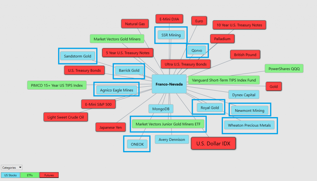
There is great value to be had in studying and understanding the key drivers of $FNV price action. This graphic presents a plethora of opportunities that can quickly be explored within the software.
This is an amazing research tool that consistently uncovers future gems.
One of the key reasons that we chose to analyze $FNV this week is because comparatively it has outperformed the other connected price drivers in this sector.

Our Suggestion
We are paying very close attention to CUP and Handle pattern on the long-term gold chart as well as to the 10-year high boundaries on $FNV. The confluence of these two factors paints a very potentially explosive narrative.
Our thoughts are that the entire stock market has stalled until the FED makes a move on interest rates. I’ve written extensively about this over the past several weeks and will be writing more on the blog about this shortly.
Over the last 13+ years they have tried multiple times to cut bond purchases and raise rates and each time their attempts have been met with sharp selloffs in stock prices.
We think the Fed is between a rock and a hard place and as much as they want to raise rates, they recognize that the risk is sky high. Either way we think $FNV is positioned to benefit from this market anxiety. It’s an asset which has proven the market indexes and is positioned amazingly well to benefit from a rising trend in oil and gold.
The a.i. has us LONG and we will look to add to our position should the CUP and HANDLE confirm our analysis.
The one factor that separates great traders from amateurs is money management.
An amateur trader will risk their entire portfolio on one trade and lives for the adrenalin rush that the risk creates.
We think that the volatility will be increasing in stocks throughout 2022. As it does $FNV should do quite well Look to buy retracements in this asset with tight stops always practicing good money management.
If and WHEN we make new 10-year highs in GOLD and $FNV this stock is potentially super explosive. Put it on your radar and PAY ATTENTION.
Let the a.i. act as your guidance system. We think it is prudent to look for buying opportunities in any breaks in the price action.
We will look for opportunities of sudden breaks in the market if the a.i. forecast remains UP to scale in small positions with tight stop losses.
Let’s Be Careful Out There!
Remember, It’s Not Magic.
It’s Machine Learning.
IMPORTANT NOTICE!
THERE IS SUBSTANTIAL RISK OF LOSS ASSOCIATED WITH TRADING. ONLY RISK CAPITAL SHOULD BE USED TO TRADE. TRADING STOCKS, FUTURES, OPTIONS, FOREX, AND ETFs IS NOT SUITABLE FOR EVERYONE.
DISCLAIMER: STOCKS, FUTURES, OPTIONS, ETFs AND CURRENCY TRADING ALL HAVE LARGE POTENTIAL REWARDS, BUT THEY ALSO HAVE LARGE POTENTIAL RISK. YOU MUST BE AWARE OF THE RISKS AND BE WILLING TO ACCEPT THEM IN ORDER TO INVEST IN THESE MARKETS. DON’T TRADE WITH MONEY YOU CAN’T AFFORD TO LOSE. THIS ARTICLE AND WEBSITE IS NEITHER A SOLICITATION NOR AN OFFER TO BUY/SELL FUTURES, OPTIONS, STOCKS, OR CURRENCIES. NO REPRESENTATION IS BEING MADE THAT ANY ACCOUNT WILL OR IS LIKELY TO ACHIEVE PROFITS OR LOSSES SIMILAR TO THOSE DISCUSSED ON THIS ARTICLE OR WEBSITE. THE PAST PERFORMANCE OF ANY TRADING SYSTEM OR METHODOLOGY IS NOT NECESSARILY INDICATIVE OF FUTURE RESULTS. CFTC RULE 4.41 – HYPOTHETICAL OR SIMULATED PERFORMANCE RESULTS HAVE CERTAIN LIMITATIONS. UNLIKE AN ACTUAL PERFORMANCE RECORD, SIMULATED RESULTS DO NOT REPRESENT ACTUAL TRADING. ALSO, SINCE THE TRADES HAVE NOT BEEN EXECUTED, THE RESULTS MAY HAVE UNDER-OR-OVER COMPENSATED FOR THE IMPACT, IF ANY, OF CERTAIN MARKET FACTORS, SUCH AS LACK OF LIQUIDITY. SIMULATED TRADING PROGRAMS IN GENERAL ARE ALSO SUBJECT TO THE FACT THAT THEY ARE DESIGNED WITH THE BENEFIT OF HINDSIGHT. NO REPRESENTATION IS BEING MADE THAT ANY ACCOUNT WILL OR IS LIKELY TO ACHIEVE PROFIT OR LOSSES SIMILAR TO THOSE SHOWN.

