
Before the advent of the personal computer, all analysis was done manually. Traders developed concepts and ideas that they updated daily as market prices changed. Today you can create a detailed chart with the click of a couple buttons. In the past, it would take traders hours to update their charts at the end of the trading day.
However, one of the ongoing challenges facing all traders, is learning to look at markets outside of the lens of the U.S. dollar to better appreciate what fundamental monetary factors might be occurring. One of the ongoing themes in our blog posts is that price is simply a ratio of exchange. What that means is we can look at these ratios of exchange in non-dollar denominated currencies to see how certain assets are priced internationally. For example, over the past year we have see real estate prices across the United States explode. Has this occurred because there is a housing shortage and a supply and demand imbalance? Or is this the result of $6 trillion of new money being added to the economy in 2020 making each unit of currency less valuable? I believe real estate prices have risen primarily because of the latter. In other words, the dollar is being debased. However, every investor and trader needs to do their own research and arrive at their own conclusion.
One of the simplest forms of analysis is to price assets in different currencies and look at the performance metrics on multiple time horizons. Analysts traditionally use colors as a visual aid in quickly understanding statistical or data driven information. In this article we will be looking at the Gold market. But we are going to look at Gold through the eyes of the international community and discern whether any price trends are evident.
The twelve currencies we will use to price Gold in are:
- Mexico
- Japan
- Euro
- South Africa
- British Pound
- Australia
- New Zealand
- Brazil
- Argentina
- Canada
- China
- Russia
First, we will look at long term charts.
Then, we will compute performance of Gold over 5 different time frames priced in these different currencies to see if we can discern any trends.
The time frames we will be using are:
- 30 days
- 6 months
- 1 year
- 5 years
- 20 years
Lastly, we will organize this information into a HEAT MAP that will illustrate for us the performance of the underlying asset in an easy-to-understand visual representation.
Here is the price of Gold in Mexican Pesos:
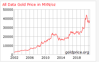
Gold Priced in Mexican Pesos
Here is the price of Gold in Japanese Yen:
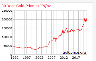
Gold Priced in Japanese Yen
Here is the price of Gold in Euros:
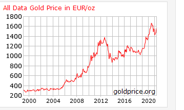
Gold Priced in Euros
Here is the price of Gold in the South African Rand:
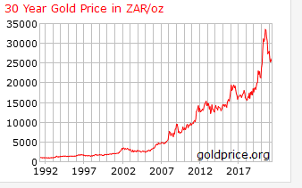
Gold Priced In South African Rand
Here is the price of Gold in British Pounds:
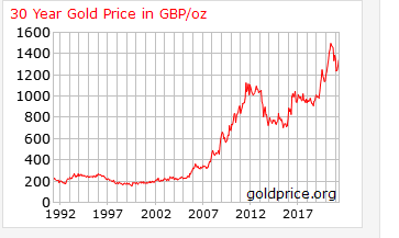
Gold Priced In British Pounds
Here is the price of Gold in Australian Dollars:
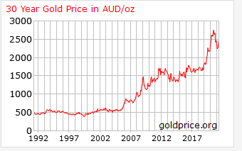
Gold Priced in Australian Dollars
Here is the price of Gold in New Zealand Dollars:
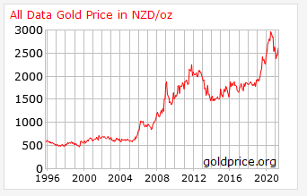
Gold Price in New Zealand Dollars
Here is the price of Gold in the Brazilian Real:
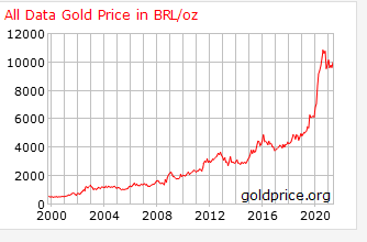
Gold Priced In Brazilian Real
Here is the price of Gold in the Argentinian Peso:
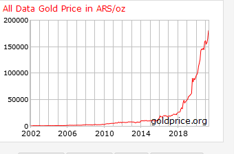
Gold Priced In Argentinian Pesos
Here is the price of Gold in the Canadian Dollar:
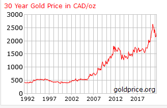
Gold Priced IN Canadian Dollars
Here is the price of Gold in the Chinese Yuan:
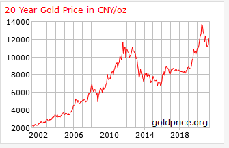
Gold Priced in Chinese Yuan
Here is the price of Gold in the Russian Ruble:
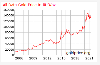
Gold Priced In Russian Ruble
Do you notice anything in looking over these twelve charts?
The first thing to observe is that, over the long term, regardless how you price Gold the longest-term trend is UP.
The second thing to observe is if you have a holding period of five years or longer, the trend is also very positive for Gold.
Lastly, the third thing to notice is that even if you had the absolute misfortune of buying in any of the currencies at the absolute high that usually within 5-8 years the uptrend resumes.
As I started doing this research, I became more and more intrigued by the reality that regardless how you price Gold each chart displays a slightly different pace of currency debasement.
Gold is often criticized as a barbarous relic and a non-interest-bearing asset. However, if you look at any of the charts, I have displayed so far you can see that its purpose is primarily one of maintaining purchasing power. 50 years ago, Gold was $35 an ounce. Today it is trading at $1900 an ounce which represents a 5,329% difference.
From this data and the numbers which create the charts, we can construct a heat map. This is a graphical and visual representation which can provide an efficient and comprehensive perspective at a glance. Heat maps allow users to isolate trends very quickly and immediately drill down in the problem areas where more research might be required. They are extremely helpful in visually representing the performance of an asset.
Here is the Heat Map for Gold when priced in the twelve foreign currencies.
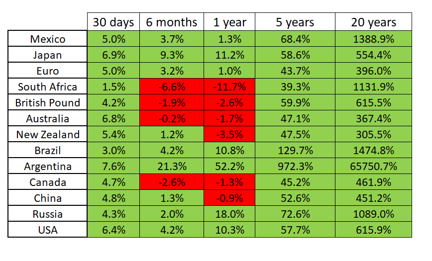
Gold Priced In Foreign Currencies Heat Map
What do you notice?
Look how small the RED areas are in comparison to the GREEN areas. There are 65 quadrants in this heat map and 55 of those quadrants are GREEN. But even more striking is the largest negative returns are miniscule in comparison the positive returns. Naturally, these numbers can change but, at this time, GREEN clearly outweighs the RED.
Macro analysts perform this type of analysis on all assets when they are developing their investment thesis. You can see how valuable this can be, but also how time consuming it is to harvest the data, organize it and present it in a manner that is understandable and actionable. The key point is in today’s age of massive government spending, this type of analysis is extremely valuable in protecting your nest egg and portfolio.
Equally of importance is that at the beginning of every bull cycle in the precious metals the naysayers in the media expound upon how Gold is a horrible investment.
Compared to what?
The heat map is very helpful in this regard at permitting a trader and investor to see the truth very quickly. The numbers don’t lie.
A large analytical firm will apply this analysis to commodity prices, real estate, stock valuations, cryptocurrencies, fixed income securities to ascertain where the risk and potential reward trends might be.
How do you go about making your investment and trading decisions?
What has your performance been like?
What is your perspective on Gold right now?
Let me share with you a quicker, more concise, and extremely effective way to help you make trading decisions – artificial intelligence, machine learning and neural networks.
The very heart of the VantagePoint Software is what we refer to as the predictive blue line. This blue line is computed every day by looking at the key statistically correlated price drivers of an underlying asset, as well as the assets price history, to determine a directional forecast as well as making the best move forward for a trader.
The rules are very simple:
To understand and appreciate how powerful this indicator is, take a look without any of the daily price bars on the chart.
- The slope of the predictive blue line determines the medium-term trend. Monitor where you would look for opportunities to buy when the slope of the blue line is going up.
- When the slope of the blue line is going sideways, you would be anticipating sideways prices.
- Likewise, when the slope of the blue line is going down you would be anticipating lower prices and opportunities to sell or short.
Here is a chart of GOLD prices in US dollars over the last 6 months.
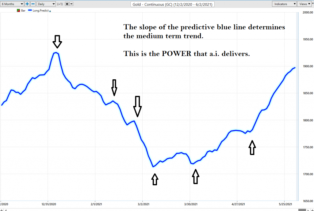
Vantagepoint A.I. Predictive Blue Line Forecast
Observe “when” the SLOPE of the predictive blue line started moving lower and how price behaved.
Observe when the SLOPE of the predictive blue line started moving higher and how price behaved.
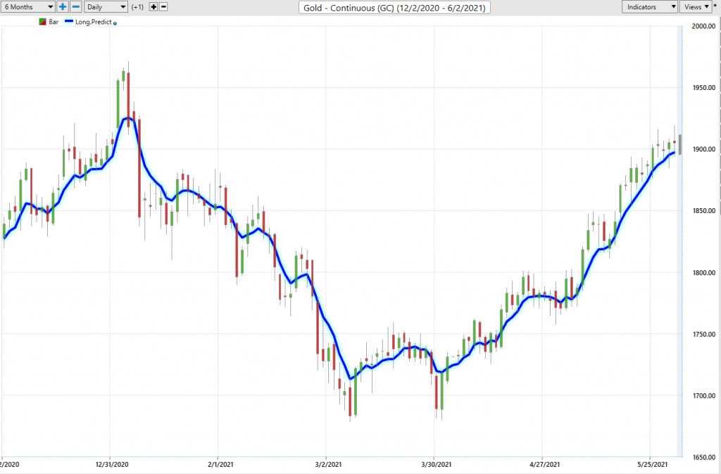
Gold with Vantagepoint A.I. Forecast
As I have laid out in this short blog post, the longer-term trends clearly support Gold. But as a trader and investor, we all live, eat and breathe over the shorter term. In today’s world where information and headlines change by the minute, we all need a North Star to orient our trading decisions around.
There aren’t enough hours in a day for you to be able to make sense of these monumental changes affecting the financial markets manually. This is why, in 1991, Louis Mendelsohn introduced artificial intelligence as the ideal quantitative solution for traders and investors.
Think long and hard about HOW you are going to trade the markets if you do not have an edge. As the volatility of the last decade becomes commonplace are you prepared for the disruption that wild volatility will create?
Think about those losing trades and ask yourself what did you learn from that experience? What is your method for analyzing risk? What is your systematic framework for defining opportunity?
Let me lay it out for you in black and white.
Two traders looking at the same market at the same time.
One is armed with artificial intelligence.
The other is not.
Who do you think is better prepared to win in this scenario?
Knowledge. Useful knowledge. And its application is what ai delivers.
Artificial intelligence is not “a would be nice to have” tool.
It is an “absolutely must have” tool to flourish in today’s global markets.
Machine Learning is designed to learn from experience and make the best statistically relevant decision moving forward. A.I. outperforms human analysis hands down every time.
We live in very exciting times.
What hurts others can instruct us.
A.I. is the framework where risk and opportunity are very clearly defined.
Remember, artificial intelligence has decimated humans at Poker, Jeopardy, Go! and Chess. Why should trading be any different?
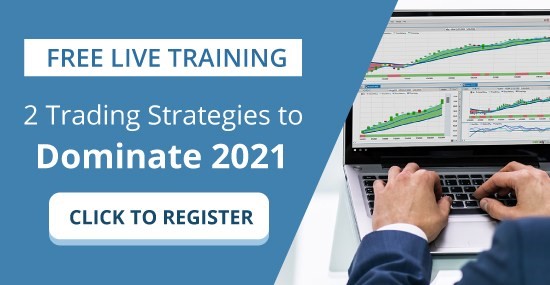
Visit with us and check out the A.I. at our Next Live Training.
Discover why Vantagepoint’s artificial intelligence is the solution professional traders go-to for less risk, more rewards, and guaranteed peace of mind.
It’s not magic. It’s machine learning.
Make it count.
IMPORTANT NOTICE!
THERE IS SUBSTANTIAL RISK OF LOSS ASSOCIATED WITH TRADING. ONLY RISK CAPITAL SHOULD BE USED TO TRADE. TRADING STOCKS, FUTURES, OPTIONS, FOREX, AND ETFs IS NOT SUITABLE FOR EVERYONE.
DISCLAIMER: STOCKS, FUTURES, OPTIONS, ETFs AND CURRENCY TRADING ALL HAVE LARGE POTENTIAL REWARDS, BUT THEY ALSO HAVE LARGE POTENTIAL RISK. YOU MUST BE AWARE OF THE RISKS AND BE WILLING TO ACCEPT THEM IN ORDER TO INVEST IN THESE MARKETS. DON’T TRADE WITH MONEY YOU CAN’T AFFORD TO LOSE. THIS ARTICLE AND WEBSITE IS NEITHER A SOLICITATION NOR AN OFFER TO BUY/SELL FUTURES, OPTIONS, STOCKS, OR CURRENCIES. NO REPRESENTATION IS BEING MADE THAT ANY ACCOUNT WILL OR IS LIKELY TO ACHIEVE PROFITS OR LOSSES SIMILAR TO THOSE DISCUSSED ON THIS ARTICLE OR WEBSITE. THE PAST PERFORMANCE OF ANY TRADING SYSTEM OR METHODOLOGY IS NOT NECESSARILY INDICATIVE OF FUTURE RESULTS. CFTC RULE 4.41 – HYPOTHETICAL OR SIMULATED PERFORMANCE RESULTS HAVE CERTAIN LIMITATIONS. UNLIKE AN ACTUAL PERFORMANCE RECORD, SIMULATED RESULTS DO NOT REPRESENT ACTUAL TRADING. ALSO, SINCE THE TRADES HAVE NOT BEEN EXECUTED, THE RESULTS MAY HAVE UNDER-OR-OVER COMPENSATED FOR THE IMPACT, IF ANY, OF CERTAIN MARKET FACTORS, SUCH AS LACK OF LIQUIDITY. SIMULATED TRADING PROGRAMS IN GENERAL ARE ALSO SUBJECT TO THE FACT THAT THEY ARE DESIGNED WITH THE BENEFIT OF HINDSIGHT. NO REPRESENTATION IS BEING MADE THAT ANY ACCOUNT WILL OR IS LIKELY TO ACHIEVE PROFIT OR LOSSES SIMILAR TO THOSE SHOWN.

