During the tail end of the 1970’s gold prices rose as a hedge against inflation. Our view is that gold has been more of a deflationary hedge time around. In other words if the peak in interest rates in 1980 marked the top for inflation then the bottom for yields should represent the bottom for deflation. At least that is our premise for today.
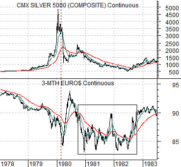
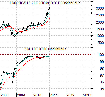
Below is a chart comparison between silver futures (we are using silver in place of gold because the basic trends are quite similar) and 3-month eurodollar futures from 1978 into 1983.
Eurodollar prices trended lower into the spring of 1980 until the trend for silver prices finally collapsed. This was the markets’ way of saying that the trend towards rising inflation had come to an end. The Volcker Fed, of course, was not paying close attention to the markets’ message as it kept upward pressure on yields into 1982. High short-term yields coupled with declining inflation led to a double-dip recession in 1981 and 1982 along with a fairly nasty equity bear market.
Below we feature a chart comparison between silver futures and 3-month eurodollar futures from the current time frame.
Our thought is that the rising trend for gold and silver has been driven by money concerned about the viability of a heavily leveraged financial system in a trend towards asset price deflation. As long as investors are concerned about U.S. economic prospects there will be downward pressure on yields and upward pressure on gold and silver. Fair enough.
The point that we have been trying to make in recent weeks is that the banks shares and long-term yields are starting to move higher. Bit by bit and economic report by economic report the consensus is shifting towards an improvement in growth which, in turn, is helping to ease concerns about asset price deflation.
In sequence we have expected to see the banks turn to the upside along with long-term yields and then… sooner rather than later… some kind of price break for the precious metals. With a new quarter and year on the go this is about the right place and the right time for some downward pressure on metals prices to develop. Yesterday may well have marked both the end of the rally for gold and silver and the start of a multi-year trend towards a positive and growing inflation rate.
Equity/Bond Markets
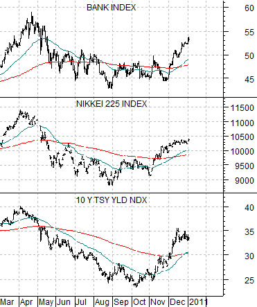
Next is a comparison between 10-year Treasury yields (TNX), the Nikkei 225 Index, and the Bank Index (BKX).
We are periodically (i.e. often) guilty of trying to make the markets agree with our views. This may well be another example of this kind of argument.
IF weaker metals prices suggest an easing of deflationary pressures THEN it makes sense to assume that yields will eventually move higher. Fair enough. After all, if yields are not rising then we have not yet escaped from disinflationary or deflationary pressure. IF yields move higher THEN one has to concentrate equity positions in those sectors that are either causing yields to rise OR benefitting from yields rising.
The chart argues that through the final quarter of 2010 the banks and the Japanese equity market responded in a positive manner to higher interest rates.
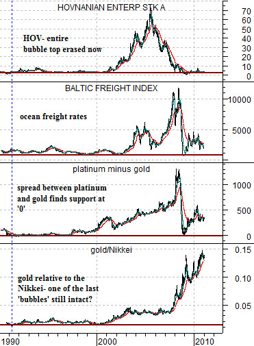
Further below is a chart comparison that we have not shown for some time. The chart compares home builder Hovnanian (HOV), the Baltic Dry Index, the spread between platinum and gold futures, and the ratio between gold prices and the Nikkei 225 Index.
The argument is that the markets have created and then obliterated one bubble after another. The home builders surged higher following the end of the tech bubble in 2001 followed by ocean freight rates. The spread between platinum and gold followed freight rates to a peak in 2008.
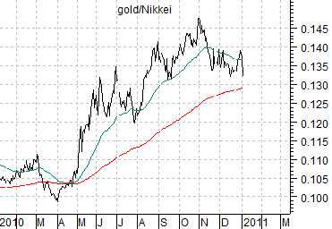
In a sense the idea is that gold represents one of the markets that still appears to be in bubble-mode while the Nikkei has been under pressure for the past 20 years due to Japan’s slide into deflation. If the Nikkei represents the bearish side of deflation while gold is the positive side then the gold/Nikkei ratio does a nice job of defining the trend.
Last is a shorter-term view of the gold/Nikkei ratio. The ratio peaked at the end of October but remains nicely above the rising 200-day e.m.a. line.
Our thought here is that as long as yields are trending higher it likely makes sense to stress the Nikkei from the long side and gold from the short side. Of course fading a relentlessly positive trend is usually a bad idea but at the start of a new quarter and year trends often reverse.