
One of the great challenges facing traders is trying to make sense of important economic barometers and determine what those indicators mean.
Every day, traders and investors are bombarded with mountains of economic information that quickly become incomprehensible in the absence of some guiding principle. I love to ask traders the question, “What is your North Star?” This question challenges traders to orient news, data and events around a guiding principle that permits effective organization and decision making.
Over the past few weeks, every financial pundit has been talking about the yield curve. This article will explain what the yield curve is, its importance as an economic barometer, and specifically why it has everybody on edge lately.
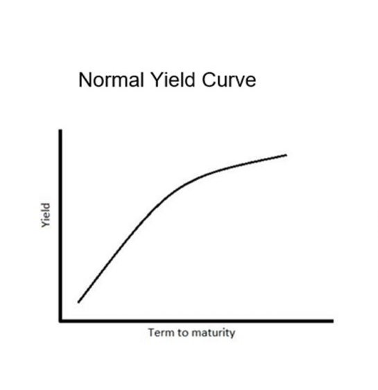
The yield (interest rates), on a bond is the return that an investor will earn if they purchase a bond and hold it until maturity. Since bonds and notes are sold by the U.S. Treasury with multiple maturity dates, the yield curve is essentially a graph that charts the amount of money that will be returned to you if you buy a treasury security and hold it till maturity. The yield (interest rate you receive) goes on the y axis of the chart. The amount of time for which you loan your money to the government, also referred to as the maturity, is plotted on the x-axis.
When a yield curve is constructed correctly, we only consider the bonds/notes from a group of similar quality, this means only bonds/notes from the same risk class or with a similar level of liquidity. Under normal economic conditions, when you plot these interest rates you create an upward slope. This makes total sense because if you were to buy a 3-month treasury, you would expect a smaller interest rate than if you were willing to loan the government your money for a much longer time frame. In other words, the uncertainty about the future is defined as the “risk” in the transaction and you as a fixed income investor are demanding a higher yield for willing to assume that greater risk.
To understand the yield curve interest rates, understand it is annualized for comparative purposes. In other words, if the yield on a 1-year treasury is 1%, that is comparable to a 30 day treasury is yielding 1/12 of 1%.
Thus, the yield curve historically reflects the marketplace’s sense of strength of the economy. While the yield curve shows how the return on bonds varies over different periods into the future. The gradient or slope of the yield curve gives an indication of forthcoming interest rate changes (risk) the cost of money and its effect on economic productivity.
When the yield curve is upward sloping like the graph below, things are considered normal. Savers can loan their money into the future successfully and be compensated for what is perceived to be very minimal risk.
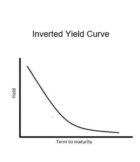
But when this curve begins to flatten or invert, it communicates that yields short term are higher than the long term. That historically is a very accurate predictor of economic contraction and recession. More importantly, it communicates investors in fixed income securities are unwilling to commit towards longer-term investments and they are requiring greater compensation on the short-term end of the curve.
What does this mean?
Historically, inverted yield curves have been considered very accurate predictors for worsening economic situations. The last 7 economic recessions were all preceded by an inversion of the yield curve!
There are two drivers of the yield inversion: one at the short end of the curve (reflecting short term expectations) and one at the long end of the curve (reflecting longer term expectations).
In the shorter term, if investors have expectations of economic conditions deteriorating, then short-term bonds may be perceived as having higher risk primarily because default risk increases in periods of bad economic conditions. Thus, investors demand higher yields on short term bonds as compensation for this additional risk. Likewise, when the perception is that the economy is worsening, fixed income investors will not tie up their money in longer-term maturities.
The difference in interest rates between the short-term yields and the longer-term yields is referred to as the “spread.” Economists often monitor yield curve by comparing the yields of the 30-day treasury versus the 10 year note. Or you will often see comparisons of the 2 year note versus the 10 year note.
Here is a chart created by the Saint Louis Federal Reserve Bank monitoring the yield curve going back to 1980. The periods in grey are the economic recessions that have taken place.
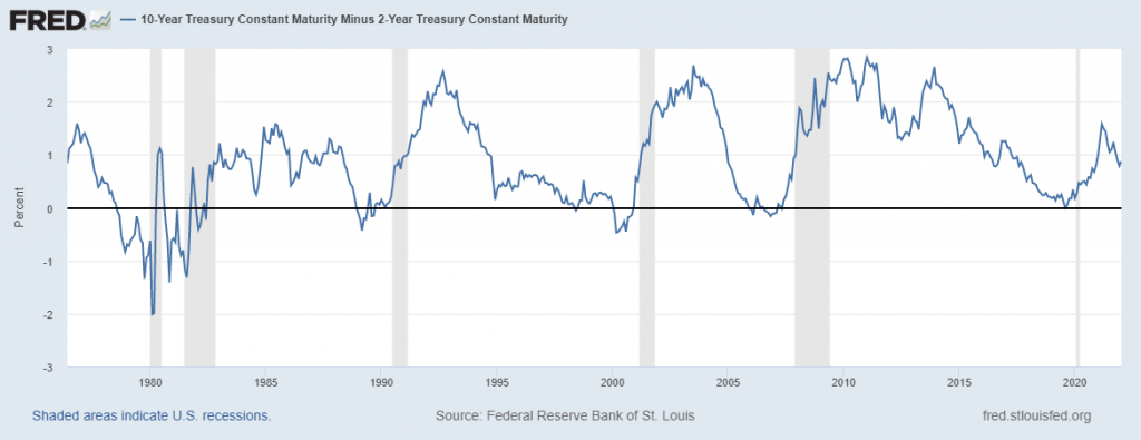
You can see that recessions occurred within 18 months of a yield curve inversion. Sometimes these recessions were very brief. Sometimes they were lengthy. What traders are concerned about in these environments is the effect that a yield curve inversion will have on stocks. Historically, that also has not been positive.
Many economists monitor the yield curve for the major G8 nations for clues as what economic conditions in the developed world are looking like moving forward. Traditionally, when a yield curve begins to either flatten or invert is when the warning bells begin to sound in the financial markets around the world.
Is This Much Ado About Nothing?
Long time readers of this blog know that the one economic barometer which I pay attention to is the real rate of return. This is considered to be the risk free rate and is calculated by subtracting the inflation rate from the yield on the 10 year note. For many, many years this yield has been negative.
Currently, the yield on the 10-year Treasury is 1.735%.
Currently, the last Consumer Price Index Report showed inflation spiking to 6.8%!
That makes the REAL RATE of Return is a negative 5.065%!
This metric tells you all you need to know about the true underlying health and integrity of the financial economy. Fixed income investors are losing 5.065% per year when they loan the U.S. Treasury their hard-earned savings. In other words, savers can’t save!
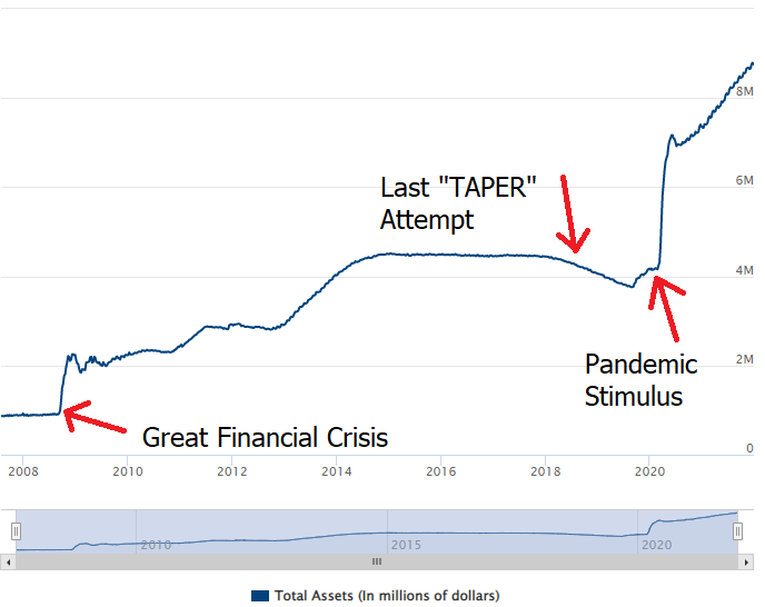
Since the beginning of the pandemic, the Federal Reserve has been buying $120 billion dollars a month of U.S. Treasuries. Last month they signaled that they would stop doing this by March 2022 and they would gradually start raising interest rates. Since the Great Financial Crisis of 2008, the Fed has been unable over any meaningful time frame to reduce its bond purchases and raise interest rates. Whenever they have attempted to do so in the past the stock market has always cratered.
Traditionally, Investor preferences of liquidity and expectations of future interest rates shape the yield curve. But there is nothing traditional about the current financial environment. The Fed is the sole and primary buyer of Treasury securities.
Just yesterday afternoon the Fed minutes from its most recent FOMC meeting were released. In that announcement the Fed reiterated that it would reduce its monthly bond purchases.
Here is why this is important and a couple of questions worth pondering.
Who is going to buy the $120 billion of government bonds if the Fed stops?
Do you know of any investor who would willingly invest their savings into an investment where they were guaranteed to lose 5% by purchasing Treasury Bonds?
What options does the Fed have?
The Fed’s balance sheet has grown exponentially since the Great Financial Crisis. In 2007 the Fed’s Balance sheet stood at $870 million. That was the entirety of their purchases since their inception in 1913. Today the Fed’s balance sheet has boated 954% to 9.2 trillion. They have been buying $1.4 trillion worth of Bonds annually.
The entire purpose of the “Too Big to Fail” programs instituted by the Fed 13 years ago was that pushing interest rates to zero and them buying bonds would stimulate the economy enough to generate more additional tax revenue. Neither of these occurred.
If they raise interest rates, the cost of financing the government debt goes up exponentially. When interest rates go from 1.5% to 1.75% that 25 basis point increase is the equivalent of a 16% increase in the cost of borrowing. Since the debt is being financed on the short end of the yield curve every 5 years, that additional cost of borrowing is very consequential.
If the U.S. is having trouble paying back the 26+ trillion in debt at lower rates what makes us think we can pay it back any better at higher rates?
If the government raises taxes, it becomes a drain on business economic productivity.
If the government reduces spending it also reduces business productivity.
The most ironic part of this announcement was that the Fed said it would end its tapering in March while continuing to make bond purchases in January 2022.
Any way I look at it the Fed is caught between a rock and a hard place. They genuinely want to reduce bond purchases. They genuinely want to raise interest rates. Doing either drives the economy off the fiscal cliff.
At the core of this madness is that pundits in the media are defining economic health as the Fed continuing to buy $1.4 trillion in government bonds annually.
Here are a few more charts for you to peruse as you contemplate these issues.
The first is the annual weekly chart 2-year U.S. Treasury Note.
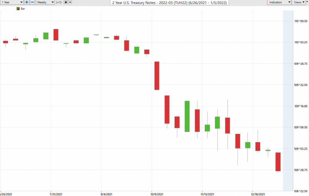
As fixed instrument prices fall the yields increase. This chart is clearly in a downtrend and communicates loud and clear that the short end of the yield curve is increasing its interest rate very quickly.
As a comparison, here is the chart of the 10-year Treasury Note.
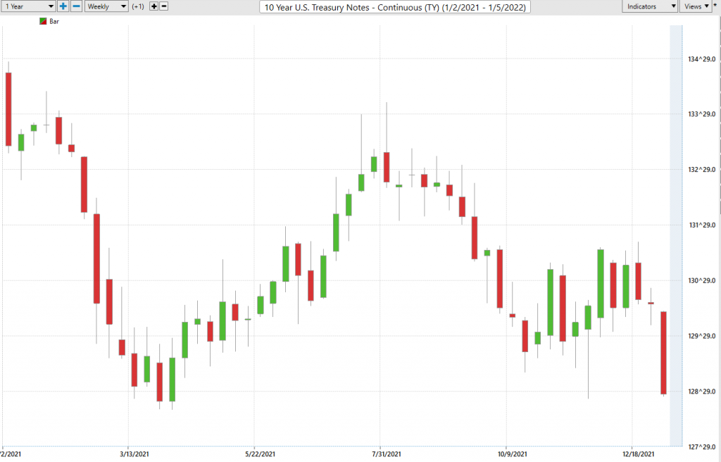
Observe how this weekly chart of the 2021 price action on 10-year U.S. Notes, has not made a new “lower low” yet.
When you put both charts together you quickly can see that 2-year notes are falling much faster than 10 year notes. And this predicament is signaling loud and clear that should the yield curve invert, the fixed income market is forecasting a recession.
The shape of the yield curve changes with the perception of the health of the economy. My concern is that an economy is not healthy when the Fed is the only buyer of the government’s debt. And this being the case, the only thing that matters is the Fed. Traditionally a yield curve inversion is a very bad omen for the economy. It might be so today, but until the Fed cuts the purse strings by supporting the economy, we are forced to look at the yield curve and the financial markets differently. For the last 13 years, since the Great Financial Crisis the Fed has taken it upon itself to manipulate interest rates for the greater good. Before this occurred an inversion of the yield curve signaled a turning of the business cycle. Today, by my estimation an inversion of the yield curve will force the Fed to continue to adopt its Quantitative Easing even though it has been completely ineffective.
I don’t think the Fed can taper without cratering the financial markets and the economy. The question I keep asking myself, is who then will buy the bonds? Or stated another way, is the government going to reduce spending so that the bond purchases don’t have to occur?
We are in uncharted waters.
Traditional economic theories don’t work for traders.
The only thing that a trader is concerned with is being on the right side, of the right market at the right time.
And that means harnessing the power of VantagePoint’s artificial intelligence.
Everything else is just noise.
The race to debase is very real. This economic environment is forcing traders into much shorter time frames as everyone in the marketplace chases yield.
Real asset prices will keep rising as the yield chase intensifies. Cheap capital will keep flooding the market. And our economy will continue its addiction to a horrible monetary stimulus.
Do you have the tools and ability to find the strongest trends at right time in this economic environment? What is your plan for maintaining your purchasing power as this trend accelerates?
I’d like to invite you to visit with us at one of our live Master Class Webinars where we show how artificial intelligence is the only means to stay consistently up to date on the risk and reward opportunities in this environment.
What all traders and investors want is an accurate, proven solution that alerts you when a high probability trend is unfolding. The Vantagepoint A.I. forecasts have proven to be up to 87.4% accurate in determining the trend three days in advance.
Visit With US and check out the a.i. at our Next Live Training.
It’s not magic. It’s machine learning.
Make it count.
IMPORTANT NOTICE!
THERE IS SUBSTANTIAL RISK OF LOSS ASSOCIATED WITH TRADING. ONLY RISK CAPITAL SHOULD BE USED TO TRADE. TRADING STOCKS, FUTURES, OPTIONS, FOREX, AND ETFs IS NOT SUITABLE FOR EVERYONE.
DISCLAIMER: STOCKS, FUTURES, OPTIONS, ETFs AND CURRENCY TRADING ALL HAVE LARGE POTENTIAL REWARDS, BUT THEY ALSO HAVE LARGE POTENTIAL RISK. YOU MUST BE AWARE OF THE RISKS AND BE WILLING TO ACCEPT THEM IN ORDER TO INVEST IN THESE MARKETS. DON’T TRADE WITH MONEY YOU CAN’T AFFORD TO LOSE. THIS ARTICLE AND WEBSITE IS NEITHER A SOLICITATION NOR AN OFFER TO BUY/SELL FUTURES, OPTIONS, STOCKS, OR CURRENCIES. NO REPRESENTATION IS BEING MADE THAT ANY ACCOUNT WILL OR IS LIKELY TO ACHIEVE PROFITS OR LOSSES SIMILAR TO THOSE DISCUSSED ON THIS ARTICLE OR WEBSITE. THE PAST PERFORMANCE OF ANY TRADING SYSTEM OR METHODOLOGY IS NOT NECESSARILY INDICATIVE OF FUTURE RESULTS. CFTC RULE 4.41 – HYPOTHETICAL OR SIMULATED PERFORMANCE RESULTS HAVE CERTAIN LIMITATIONS. UNLIKE AN ACTUAL PERFORMANCE RECORD, SIMULATED RESULTS DO NOT REPRESENT ACTUAL TRADING. ALSO, SINCE THE TRADES HAVE NOT BEEN EXECUTED, THE RESULTS MAY HAVE UNDER-OR-OVER COMPENSATED FOR THE IMPACT, IF ANY, OF CERTAIN MARKET FACTORS, SUCH AS LACK OF LIQUIDITY. SIMULATED TRADING PROGRAMS IN GENERAL ARE ALSO SUBJECT TO THE FACT THAT THEY ARE DESIGNED WITH THE BENEFIT OF HINDSIGHT. NO REPRESENTATION IS BEING MADE THAT ANY ACCOUNT WILL OR IS LIKELY TO ACHIEVE PROFIT OR LOSSES SIMILAR TO THOSE SHOWN.

