
Charts are what traders use to discern trading opportunities. Over the years in speaking with thousands of traders most traders make charting unnecessarily complicated. In this article I’m going to simplify Japanese Candlestick charts and share my favorite pattern.
As the story goes, the concept for Candlestick charting was created by Munehisa Homma, a Japanese rice trader. Homma started drawing his charts differently from other traders and found certain repeatable patterns in the rice market which he believed were influenced by the emotions of traders, while still acknowledging the effect of demand and supply on the price of rice.
What Homma created in essence was a means of drawing a visual graphic relationship between a starting point and an ending point.
Charts traditionally were drawn as follows:
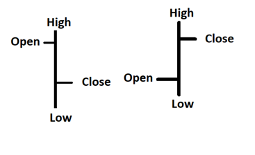
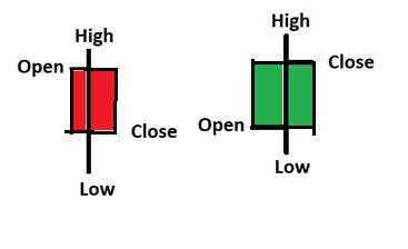
What Homma did is he drew a box around the opening price and the closing price, and the candle was born. The body of the candle is the space between the open and the close. The wicks are the space outside of the body.
- If the closing price was less than the opening price traders traditionally color it in red.
- If the closing price is higher than the opening price traders traditionally color it in green.
What candles are at their essence is a fast graphical visual means of comparing the opening price to the closing price over a period of time.
There are hundreds of different patterns that traders often obsess over. The vocabulary of candlestick charting is filled with buzzwords that makes you want to be part of the “club.”
Steve Nison brought all these varieties of Candlestick patterns to the Western world, while he was an analyst at Merrill Lynch in his popular 1991 book, “Japanese Candlestick Charting Techniques”, which has become a trading classic.
While I recommend studying charting techniques, let me simplify something. I learned this from a veteran at the Chicago Board of Trade. This veteran floor trader only traded off the monthly charts, it was also how he defined a trend.
There are only five conditions that a market can be in at any given time.
- A market can be trading above the previous bars high.
- A market can be trading above the previous bars close.
- A market can be unchanged.
- A market can be trading below the previous bars close.
- A market can be trading below the previous bars low.
That is, it!
Pretty simple and straightforward!
Where do you think all the action and opportunity is?
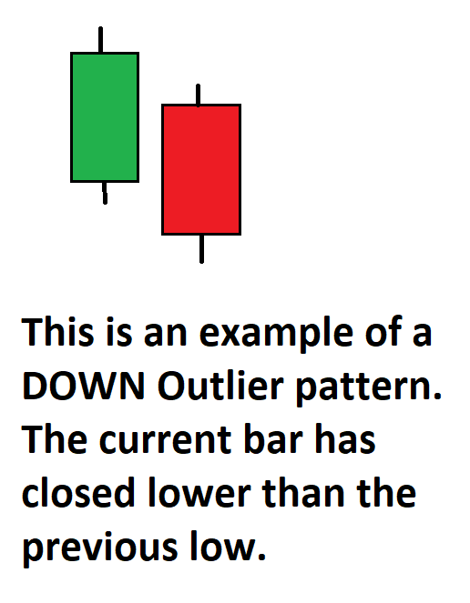
If you said the extremes, you are 100% correct! I refer to these extremes as the OUTLIERS. My suggestion is that when you look at charts moving forward, look for the OUTLIER pattern.
Why?
Any time that a market is trading above a previous high, in an established trend it is communicating that demand is greater than supply and the trend is strong.
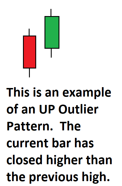
The inverse is also true, when price is trading below the previous low, it is saying that supply is greater than demand and the trend is weak.
In other words, the OUTLIER pattern is where the trend “IS.” This is very true particularly when you study the weekly and monthly charts. These are exactly the types of trends that we as traders are looking for!
Unfortunately, many new traders obsess over the correct classification of the candlestick pattern name.
The only thing that you should obsess about is where are the best trends to trade.
Seeing a market close above the previous bar’s high on the monthly charts normally only happens about 30% of the time.
We focus on the monthly charts initially since this pattern seems to be quite accurate in seeing follow through two to four months out. It is a longer-term chart that allows us to accurately define the long-term trend. Start on the monthly charts and then dig in to the weekly and daily to fine tune your entries.
Let’s look at the top performing sectors of the past year and see how this very simple and practical outlier pattern displayed itself on the weekly and monthly charts.
Over the past year here are some performance metrics to be aware of:
Bitcoin is up $384%
Crude Oil is up 92%
Facebook is up 29%
Apple is up 27%
Amazon is up 8%
Netflix is up 31%
Google is up 78.5%
While these returns have been impressive, our trading style is using the artificial intelligence to capture short term swing trades when the probabilities favored a move in the direction of the trend. The most important consideration that any trader must contend with is to continuously ask, “where are the best trends?”
As a quick review all we are going to do is look for the occurrences on the chart where it closed higher that the previous months high as well as when it closed lower than the previous months low. That simple barometer, is what we refer to as the “outlier pattern.” It will act as our definition of the long-term trend for the time being.
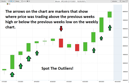
Here is Bitcoin on the weekly charts. Bitcoin was trading at $34,000 at the beginning of this chart and now it is trading at $66,000. Look at how many times the weekly outlier pattern occurred and how the trend continued to follow suit.
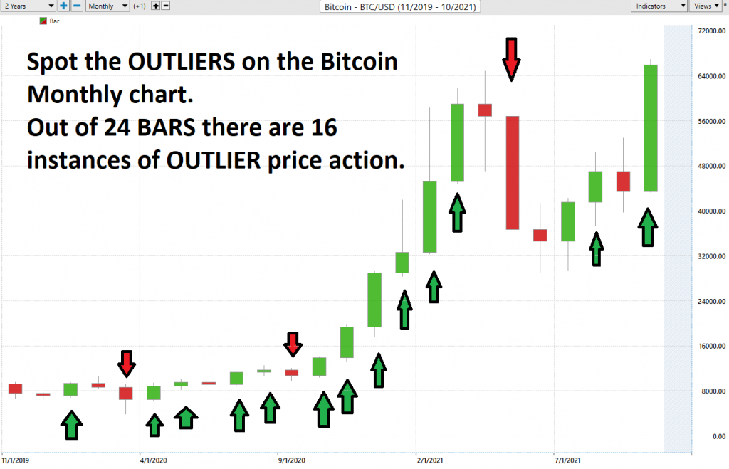
Here is the bitcoin monthly chart over the past two years.
Next, let’s look at the Crude Oil and the FAANG stocks.
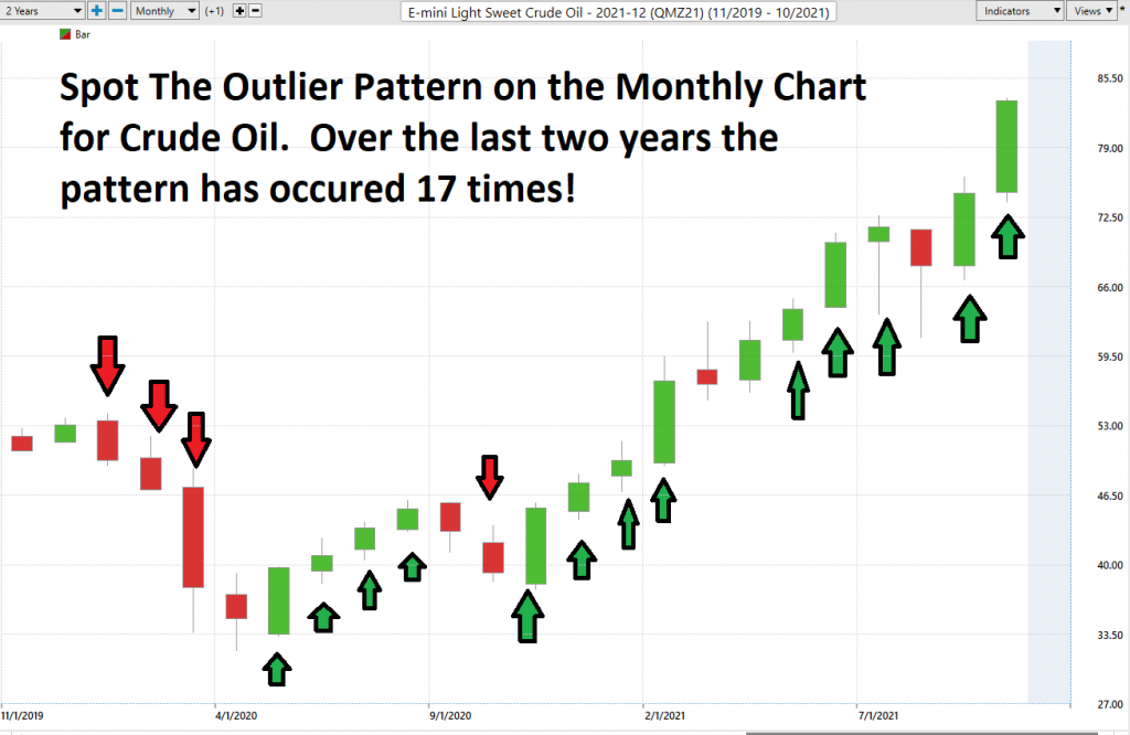
Here is Crude Oil.
Over the last two years the outlier pattern has shown up 17 times on the monthly chart. Pay attention to this simple indicator when you trade.
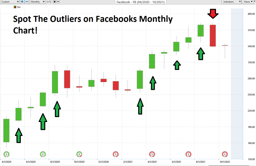
Here is Facebook. The first outlier occurred when Facebook was trading at $226. It has traded as high as $383 and is currently at $341. All we are doing is looking for markers on the monthly chart where the stock was trading above the previous high or below the previous low.
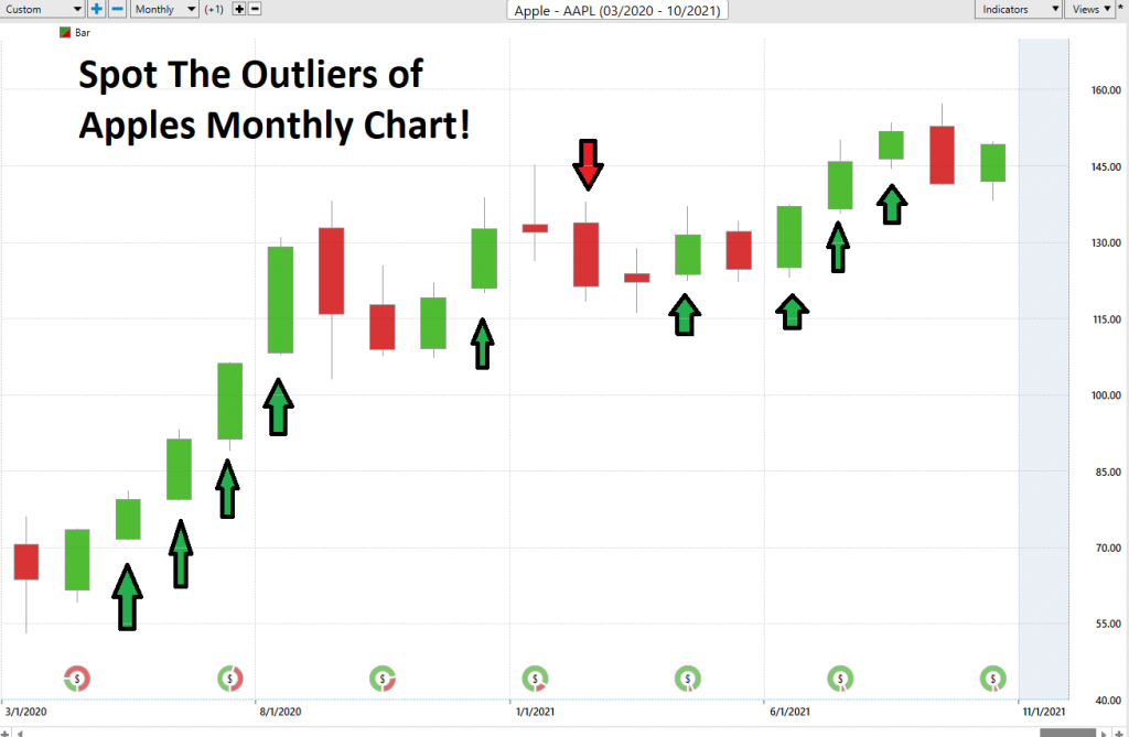
Here is Apple.
The first outlier occurred when Apple was trading at $79.66. It has traded as high as $156.95 and is currently trading at $149.
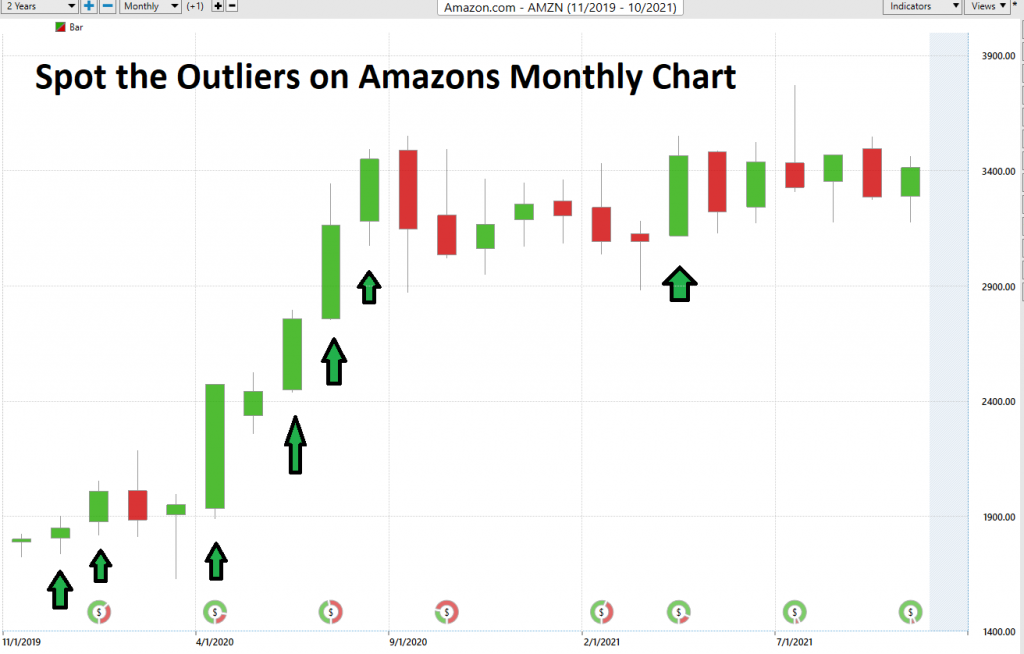
Here is Amazon. Over the last two years it has closed above its previous months high 6 times. The first outlier pattern occurred when Amazon was trading at $2013. Today it is trading at $3420.
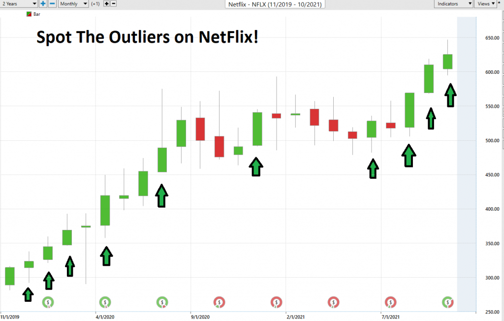
Here is Netflix.
The first outlier pattern occurred when it was trading at $324.
Over the last two years, it has had 10 instances where it has closed above the previous month’s high. Currently, NFLX is trading at $626.
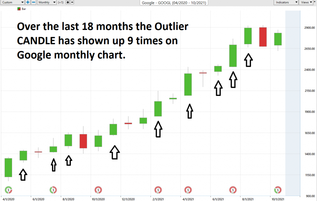
Lastly here is Google.
Over the last 18 months, the OUTLIER candle has shown up 9 times on the Google Monthly chart. The first outlier candle occurred at $1445. Google is currently trading at $2830.
How do you define opportunity in trading?
The main problem of trading is the organization of information so that effective trading decisions can be made. If you have a valid process where the probabilities are favorable to you, the reality is that you must learn to trade consistently. By doing so, you allow the compounding of gains.
Success in trading is never about how much
money you make when you are right. It is
about how little you lose when you are wrong.
Trading is all about answering the WHAT IF question.
What if you are wrong? At what point do you take your losses?
What if you are right? Do you have a strategy to add to your winning position?
In other words, what do you stand to make if you are correct? And how much will you lose if you are wrong? If you get that answer right, you are in it for the long term. Get it wrong and you are assured to run with the losers.
The basics are regularly overlooked by inexperienced traders when they hear a story about a company that has all the elements of the next superstock.
It is very sad, and unnecessary in today’s day and age of machine learning and artificial intelligence.
- A stock may have a very alluring story.
- A stock may have a very effective management team.
- A stock may have incredible earnings.
- A stock may have infrastructure, partnerships, uniqueness, etc.
But, if these elements are not reflected in the price, you are focused on what “SHOULD” occur in the market.
I would like to point out that the word SHOULD is responsible for more losses in trading than any other.
I can show you hundreds of companies with amazing press releases and publicity that “SHOULD” be the next Apple, Amazon, or Google. Unfortunately, that is not the way markets work.
Bad traders obsess on the SHOULD. Every other word out of their mouth’s is SHOULD.
If only I had just a nickel for how many times a trader has told me all the reasons why his portfolio is heavily invested in a stock because of a great story, in spite of the stock being in a firm downtrend! It’s horribly painful to listen to because it doesn’t have to be that way.
The beauty of neural networks, artificial intelligence, and machine learning are they are fundamentally focused on pattern recognition to determine the best move forward. When these technologies flash a change in forecast – pay attention, it is newsworthy.
We often do not understand why something is occurring but that does not mean that we cannot take advantage of it.
Remember What’s Important.
Price is the only thing that matters when we are trading. It is what can make you wealthy or decimate your account. Everything else is just noise.
Are you capable of finding those markets with the best risk/reward ratios out of the thousands of trading opportunities that exist?
Knowledge.
Useful knowledge.
And its application is what A.I. delivers.
Isn’t that what we all want from the markets? Consistency.
So, imagine what your portfolio would look like today had you applied artificial intelligence to it five years ago?
See for yourself how a machine-based learning software makes it easier to find statistically solid trends and generates better returns with less risk.
Most traditional indicators that traders use today were developed in the 1970’s and 1980’s. They are incapable of telling you what the market is going to do moving forward.
Once again, machine outperforms humanoid.
It’s important that you find out more and discover why artificial intelligence keeps traders on the right side of the trend at the right time.
Join us for a FREE, Live Training. We’ll show you at least three stocks that have been identified by the A.I. that are poised for big movement… and remember, movement of any kind is an opportunity for profits!
Discover why artificial intelligence is the solution professional traders go-to for less risk, more rewards, and guaranteed peace of mind.
Visit with us and check out the A.I. at our Next Live Training.
It’s not magic. It’s machine learning.
Make it count.
IMPORTANT NOTICE!
THERE IS SUBSTANTIAL RISK OF LOSS ASSOCIATED WITH TRADING. ONLY RISK CAPITAL SHOULD BE USED TO TRADE. TRADING STOCKS, FUTURES, OPTIONS, FOREX, AND ETFs IS NOT SUITABLE FOR EVERYONE.
DISCLAIMER: STOCKS, FUTURES, OPTIONS, ETFs AND CURRENCY TRADING ALL HAVE LARGE POTENTIAL REWARDS, BUT THEY ALSO HAVE LARGE POTENTIAL RISK. YOU MUST BE AWARE OF THE RISKS AND BE WILLING TO ACCEPT THEM IN ORDER TO INVEST IN THESE MARKETS. DON’T TRADE WITH MONEY YOU CAN’T AFFORD TO LOSE. THIS ARTICLE AND WEBSITE IS NEITHER A SOLICITATION NOR AN OFFER TO BUY/SELL FUTURES, OPTIONS, STOCKS, OR CURRENCIES. NO REPRESENTATION IS BEING MADE THAT ANY ACCOUNT WILL OR IS LIKELY TO ACHIEVE PROFITS OR LOSSES SIMILAR TO THOSE DISCUSSED ON THIS ARTICLE OR WEBSITE. THE PAST PERFORMANCE OF ANY TRADING SYSTEM OR METHODOLOGY IS NOT NECESSARILY INDICATIVE OF FUTURE RESULTS. CFTC RULE 4.41 – HYPOTHETICAL OR SIMULATED PERFORMANCE RESULTS HAVE CERTAIN LIMITATIONS. UNLIKE AN ACTUAL PERFORMANCE RECORD, SIMULATED RESULTS DO NOT REPRESENT ACTUAL TRADING. ALSO, SINCE THE TRADES HAVE NOT BEEN EXECUTED, THE RESULTS MAY HAVE UNDER-OR-OVER COMPENSATED FOR THE IMPACT, IF ANY, OF CERTAIN MARKET FACTORS, SUCH AS LACK OF LIQUIDITY. SIMULATED TRADING PROGRAMS IN GENERAL ARE ALSO SUBJECT TO THE FACT THAT THEY ARE DESIGNED WITH THE BENEFIT OF HINDSIGHT. NO REPRESENTATION IS BEING MADE THAT ANY ACCOUNT WILL OR IS LIKELY TO ACHIEVE PROFIT OR LOSSES SIMILAR TO THOSE SHOWN.

