
A heat map is a visual representation of the movement of assets or prices in an organized manner. It helps traders gain insight into trends and comparative strength and weakness quickly, by allowing them to see changes in market direction and intensity over a specified period. This type of data visualization can be incredibly useful for any trader, as it provides an efficient method to interpret a large amount of information with one quick glance. Heat maps are typically constructed with color-coded cells that represent various data points, making price trends at different time intervals easier to spot. The depth and breadth of trend analysis that a heat map provides makes it a valuable tool for any investor to use as part of their financial decision-making process.
An amazing resource for single time frame analysis is FINVIZ.com. FINVIZ.com’s single time frame analysis heat map is a powerful tool for traders that allows them to quickly identify strength and weakness in the financial markets. The heat map provides a glimpse into what stocks are performing well, and which ones are not. It helps traders gain perspective on recent gains and losses, as well as giving them the ability to easily compare similar stocks or industries over different time frames. Furthermore, FINVIZ.com’s heat map feature also sorts stocks and other securities based on their strength, providing valuable insights on market movements and stock performance which are invaluable for day-to-day trading decisions. Ultimately, FINVIZ.com’s single time frame analysis heat map is an invaluable tool for traders who want to identify potential opportunities in the financial markets.
Here is an example of what you see when you visit FINVIZ.com and screen for performance over the last 30 days in the S&P 500. The graphic which presents itself quickly allows traders to see what is WINNING and what is LOSING, which sectors they are in and the relative performance of each stock.
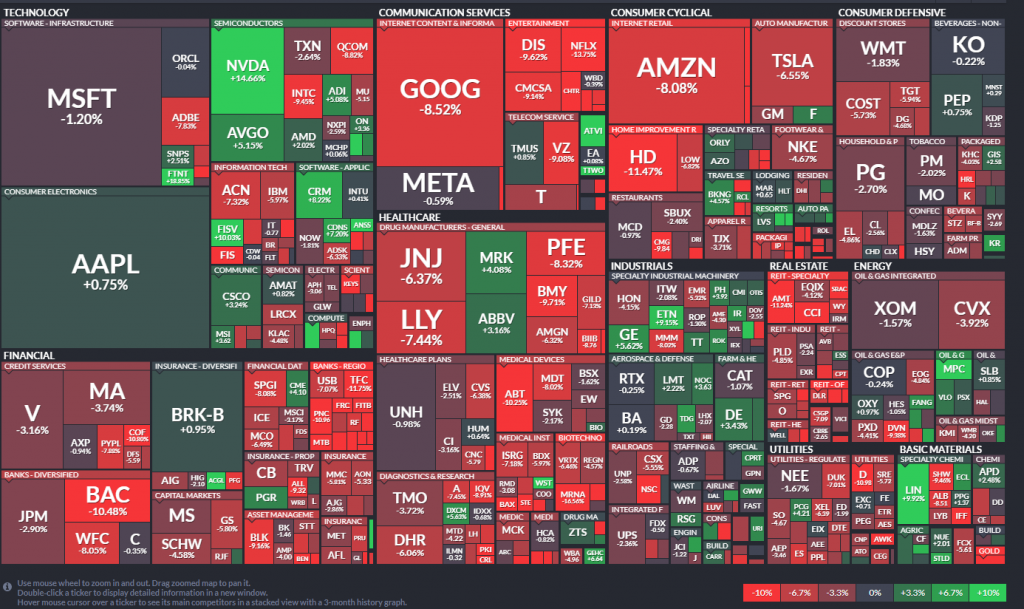
At the bottom of the page FINVIZ illustrates performance of each stock in a simple visual color-coded manner that makes understanding performance very quick and simple.
FINVIZ is an incredible resource that we suggest that all Power Traders familiarize themselves with.
In this article, I am going to revert back to some old school methods of HEAT MAPS so that all traders will be able to quickly understand what a HEAT MAP represents and how using them can assist in improving trading decisions.
To construct a heat map all that a trader needs to do is to select multiple distinct time frames and measure performance. Here is a simple HEAT MAP created of the GOLD market for the last 5 years. I‘m measuring performance for the following time frames and recording them in the HEAT MAP.
5 years
4 years
3 years
2 years
1 year
6 months
3 months
1 month
1 week
This is what the GOLD HEAT MAP looks like:

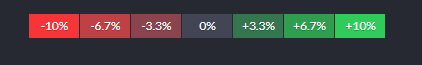
By implementing all of the different time frames you can quickly see performance for each time. The strongest trend would all share the same color, either all GREEN or all RED. While this is rare it’s an effective means traders use to screen for the strongest trends in the market.
What else do you see when you look at the graphic for GOLD’s performance?
There are 10 time frames measured.
7 of them a GREEN
3 of them are RED.
The preponderance of GREEN suggests the following analysis in GOLD. The long-term trend is UP. However, the trend is fractured at the 1 year, 1 month and 1 week time frames!
Any trader studying this HEAT map would then be looking for artificial intelligence to provide a signal or setup that would address those three fractures in the longer term market trend before pursuing any LONG position in the market.
This type of multiple time frame HEAT MAP analysis is something we perform every week whenever we do a Vantagepoint Stock Study. It allows us to compare the stock that we are evaluating to the broader market and quickly and efficiently measure and compare performance.
For example, here is the multiple time frame analysis that we performed recently on International Seaways ($INSW). Two very critical points of observation.
- Notice how $INSW was positive for each timeframe of the analysis.
- Observe how $INSW crushed the comparative performance of the broader stock market indexes.
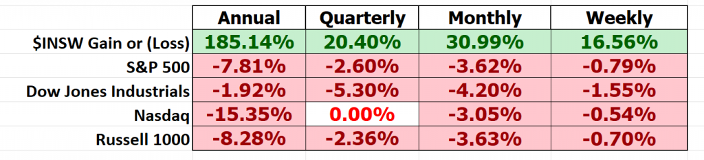
Simply based upon this type of analysis you can quickly conclude that $INSW is an ALPHA stock. Alpha is a measure of strength and profitability when it comes to stock market performance. It reflects the magnitude of an asset’s return relative to its expected performance, which can be measured in terms of risk. The higher the alpha, the greater the outperformance – that is, if one asset delivers a return greater than what was expected given its risk profile, then it has produced positive alpha. Investors look for assets with high alpha as a way of seeking excellent returns on their portfolio. Alpha measures are sometimes used to evaluate fund managers’ performance, as well as indicating how successful a particular stock’s price might be in the future based on its past performance.
We recommend that whenever you look to make a trade in the stock market, you should quickly create a HEAT MAP for the Annual, Quarterly, Monthly and Weekly time frames and compare performance to the broader stock market indexes. Doing so, will quickly let you know EXACTLY how volatile your stock is in comparison to the broader market.
But multiple time frame analysis using heat maps also offers the very distinct and powerful advantage of being able to see WHO is the leader and WHO is the LOSER. No narrative. No Excuses. No Wall Street Analysts opinions.
Here is the multiple time frame heat map analysis of the precious metals sector.
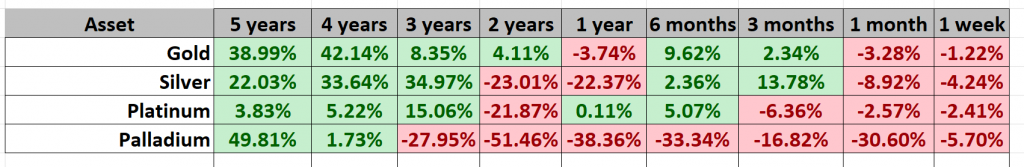
This simple graphic lets you quickly see what is strong, what is weak, along with who is winning and who is losing. This is a very powerful means of recognizing the relative strength of a sector, or market. Relative Strength in the markets is a measure of how well a particular asset has moved relative to its peers. Generally, it is measured by analyzing the price performance of a given security over a certain period of time, such as one month or three months. This allows investors to gain insight into which assets are outperforming their peers and would be more suitable for investment. By focusing on securities with strong relative strength, investors can identify stocks that may have greater upside potential compared to those with weaker performance metrics. The ability to anticipate the success of assets through their relative strength in the markets provides investors with invaluable information when making trading decisions.
This week while Federal Reserve Chairman Powell was testifying to the Senate Banking, Housing and Urban Affairs Committee we performed this analysis on the U.S. Dollar.
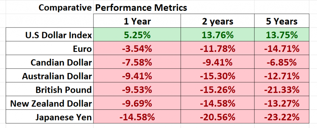
Our conclusion based upon this very simple analysis is that the U.S. dollar is the cleanest dirty shirt on the rack. It is the king of the hill as far as FIAT currencies go… Because of the interest rate hikes that the Fed has engaged in over the past year, the U.S. dollar poses the best currency risk by far. This is not intended to be an endorsement of the U.S. dollar, rather a simple performance analysis to conclude what is strong and what is weak.
A short-term trader in forex could quickly and easily drill down on this analysis and perform a multiple time frame analysis for shorter time frames.
Heat maps are fantastic tools in trading the financial markets, allowing participants to quickly spot strength and weakness of different assets. By visualizing multi-dimensional data into one overview, heat maps simplify complex topics into attainable insights that can be used to help select trades and eliminate unnecessary narrative and spin. They are especially useful when scanning a large pool of assets, such as stocks or currencies, by showing at a glance which ones show potential opportunity. Heat maps also allow traders to continually assess shifting market conditions and make better informed decisions when it matters most. Although they provide valuable information on their own, heat maps coupled with other various market analysis tools can provide an even greater understanding of how trends and conditions should be understood.
Strength and weakness is an important factor for traders to consider when trading. Knowing the strength of a particular asset or security can make it easier for traders to decide which one has better potential for future growth and profits. Knowing what is strong and weak also provides insight into the likelihood of continued trend extensions and quick wins and smaller losses, allowing traders to plan their trades more accurately and minimize the potential for large losses. Strength provides an indication of the market conditions, which should be taken into account when making any trade. By understanding what is strong and what is weak in the markets, traders can adjust their strategies accordingly and increase their chances of profitability. Strength analysis also helps to identify opportunities where strong investments could be poised to take off. Ultimately, by examining strength levels, traders can make more informed decisions that will result in increased profits over time.
Let’s apply this wisdom to the Corn, Soybeans, and Wheat markets.
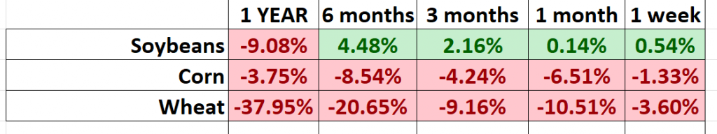
What do you see when you look at that performance graphic? Don’t complicate your analysis.
I SEE a lot of RED. Clearly, Soybeans are stronger than Corn or Wheat but even the Soybean trend is clearly fractured. But what is clearly self-evident is that the trends in CORN and WHEAT are down. I haven’t traded the agricultural markets in quite some time but just that snapshot gives me a concise and accurate understanding of what has been happening in those markets for the past year.
This type of analysis is incredibly powerful and valuable for spread traders in the futures markets. Spread trading in commodity futures markets is a low-risk way to profit from commodities. It involves taking two positions on various different, but related, commodities. This allows traders to benefit from price differentials between them without having to predict the direction of the market. By trading in spreads, traders make a profit when there is a change in the relative strength of one market with respect to another. This can be either a difference between contracts or sectors within the same market. Understanding the relative strength of each commodity is essential for spread traders as it will help them determine which one to buy and which one to sell. Ultimately, spread trading allows traders to take advantage of price movements without putting their capital at risk by predicting the overall direction of the market.
I love this type of multiple time frame heat map analysis because it is simple, effective and clearly lets you see who is winning and who is losing. In the market let’s look at a comparative analysis of the following companies.
Microsoft
Apple
Tesla
Amazon
NVidia
Alphabet
Most stock traders are very familiar with these companies. But before you look at the graphic below, who would you guess is the strongest and who is the weakest?
Read them and weep.
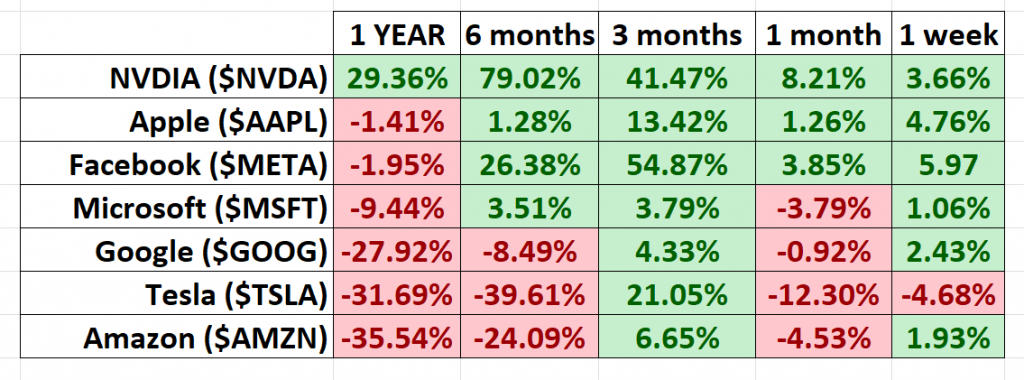
Clearly, $NVDA is the strongest trend. We did a VantagePoint Stock Study on NVDIA a few weeks back. You can find it here. At the time we commented that it was crushing the broader market performance and we saw no reason why that would change.
Surprisingly to most traders, $TSLA and $AMZN are the two laggards.
Great trading is always about buying what is strong and selling what is weak. That is how ALPHA performance metrics are created by top traders.
What does all of this mean to you as a trader.
If you are genuinely interested in creating ALPHA returns my suggestion is that you apply this type of analysis to your trading and always compare the trade you are about to make with the overall returns of the broader market.
Here is the multiple time frame heat map analysis of the broader stock market intraday as I write these words.
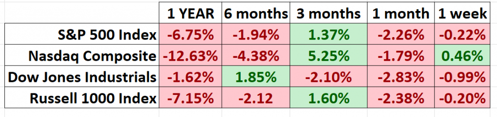
First off, you can see how fractured the broader market is. These are not horrific downtrends as many have predicted but they are negative performance metrics. As a trader, if you wanted to outperform the broader market you would need to find those assets that are currently showing better performance metrics across the board than these broader markets.
With artificial intelligence and tools like Vantagepoint’s proprietary Intelliscan this is exactly how Power Traders focus on finding the strongest and weakest trends to trade each and every day.
Success in these markets is all about who has the best tools. How quickly can you find out what are the strongest and weakest trends to trade?
Do you know which stocks are crushing the broader market?
Let’s get candid here:
The market is brutally honest – there are winners and losers.
It’s very black and white.
If you need a friend, get a dog.
If you are going to win, someone else must lose.
If survival of the fittest makes you uneasy, stay out of the financial markets.
We live in unique times.
Artificial intelligence is so powerful because it learns what doesn’t work, remembers it, and then focuses on other paths to find a solution. This is the Feedback Loop that is responsible for building the fortunes of every successful trader I know.
If you think about this question, you will begin to appreciate that AI applies mistake prevention to discover what is true and workable. Artificial Intelligence applies the mistake prevention as a continual process 24 hours a day, 365 days a year towards whatever problem it is looking to solve.
That should get you pretty excited because it is a game-changer.
It sounds very elementary and obvious. But overlooking the obvious things often hurt a traders’ portfolio.
The basics are regularly overlooked by inexperienced traders.
It is incredibly sad, and unnecessary in today’s day and age of machine learning and artificial intelligence.
A stock may have a very alluring story.
A stock may have an amazingly effective management team.
A stock may have incredible earnings.
A stock may have infrastructure, partnerships, uniqueness, etc.,
But, if these elements are not reflected in the price, you are focused on what “SHOULD” occur in the market.
And the word “should” is responsible for more losses in trading than any other.
Bad Traders Obsess on the SHOULD. Every other word out of their mouths’ is SHOULD.
I can’t recall how many times a trader has told me all the reasons why his portfolio is heavily invested in a stock because of a great story, despite the stock being in a firm downtrend. It is horribly painful to listen to.
The beauty of neural networks, artificial intelligence and machine learning is that it is fundamentally focused on pattern recognition to determine the best move forward. When these technologies flash a change in forecast it is newsworthy. We often do not understand why something is occurring but that does not mean that we cannot take advantage of it.
Most humans have a really tough time learning from bad experiences. The ego gets in the way, each and every time.
Since artificial intelligence has beaten humans in Poker, Chess, Jeopardy and Go, do you really think trading is any different?
Knowledge. Useful knowledge. And its application is what A.I. delivers.
You should find out. Join us for a FREE Live Training.
We’ll show you at least three stocks that have been identified by the A.I. that are poised for big movement… and remember, movement of any kind is an opportunity!
Discover why artificial intelligence is the solution professional traders go-to for less risk, more rewards, and guaranteed peace of mind.
Intrigued? Visit with us and check out the a.i. at our Next Live Training.
Discover why artificial intelligence is the solution professional traders go-to for less risk, more rewards, and guaranteed peace of mind.
It’s not magic. It’s machine learning.
Make it count.

IMPORTANT NOTICE!
THERE IS SUBSTANTIAL RISK OF LOSS ASSOCIATED WITH TRADING. ONLY RISK CAPITAL SHOULD BE USED TO TRADE. TRADING STOCKS, FUTURES, OPTIONS, FOREX, AND ETFs IS NOT SUITABLE FOR EVERYONE.
DISCLAIMER: STOCKS, FUTURES, OPTIONS, ETFs AND CURRENCY TRADING ALL HAVE LARGE POTENTIAL REWARDS, BUT THEY ALSO HAVE LARGE POTENTIAL RISK. YOU MUST BE AWARE OF THE RISKS AND BE WILLING TO ACCEPT THEM IN ORDER TO INVEST IN THESE MARKETS. DON’T TRADE WITH MONEY YOU CAN’T AFFORD TO LOSE. THIS ARTICLE AND WEBSITE IS NEITHER A SOLICITATION NOR AN OFFER TO BUY/SELL FUTURES, OPTIONS, STOCKS, OR CURRENCIES. NO REPRESENTATION IS BEING MADE THAT ANY ACCOUNT WILL OR IS LIKELY TO ACHIEVE PROFITS OR LOSSES SIMILAR TO THOSE DISCUSSED ON THIS ARTICLE OR WEBSITE. THE PAST PERFORMANCE OF ANY TRADING SYSTEM OR METHODOLOGY IS NOT NECESSARILY INDICATIVE OF FUTURE RESULTS. CFTC RULE 4.41 – HYPOTHETICAL OR SIMULATED PERFORMANCE RESULTS HAVE CERTAIN LIMITATIONS. UNLIKE AN ACTUAL PERFORMANCE RECORD, SIMULATED RESULTS DO NOT REPRESENT ACTUAL TRADING. ALSO, SINCE THE TRADES HAVE NOT BEEN EXECUTED, THE RESULTS MAY HAVE UNDER-OR-OVER COMPENSATED FOR THE IMPACT, IF ANY, OF CERTAIN MARKET FACTORS, SUCH AS LACK OF LIQUIDITY. SIMULATED TRADING PROGRAMS IN GENERAL ARE ALSO SUBJECT TO THE FACT THAT THEY ARE DESIGNED WITH THE BENEFIT OF HINDSIGHT. NO REPRESENTATION IS BEING MADE THAT ANY ACCOUNT WILL OR IS LIKELY TO ACHIEVE PROFIT OR LOSSES SIMILAR TO THOSE SHOWN.

