

In previous articles I have detailed how to use Excel’s data visualization functionality to highlight market information. The data is brought into Excel using Microsoft’s RTD syntax from a market information and trading platform.
The article, Excel Heat Mapping For Market Data Visualization, shows the steps to heat map percent net change and color those markets that were at the extremes of percent change up or down for the day. A separate article, Use Excel Sparklines For Data Visualization, outlines how to use data visualization to highlight the top five and the bottom five correlated markets. This feature is found in the Conditional Formatting group on the Excel ribbon.
These articles use full page examples to highlight the advantages of using Excel’s data visualization tools. Excel’s flexibility allows you to build a dashboard that can be a composite view of different types of market information. This allows you to design your own dashboards to your requirements. Figure 1 is a simple example of a composite view in Excel with market and study data supplied by CQG QTrader.
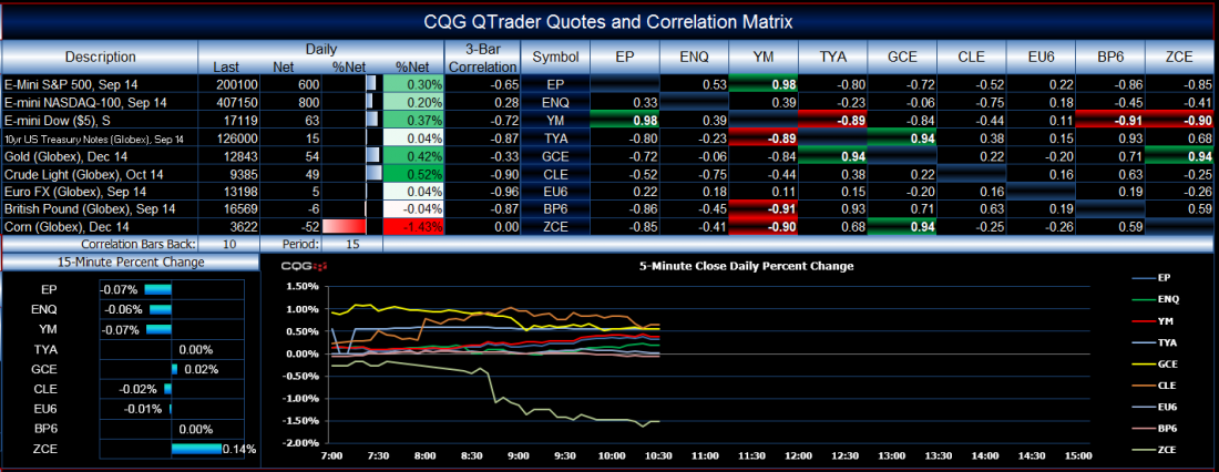
Figure 1: A composite market dashboard in Excel.
The top left section of Figure 1 is current market quotes, the top right is a correlation matrix that is heat-mapped for top (green) and bottom five (red) correlated markets. The bottom left chart is a data histogram bar chart showing percent net change. Finally, the bottom right chart is a line chart displaying each market’s percent net change for the day on a five-minute basis, which updates throughout the trading day for all of the symbols. Building this chart is the topic of this article.
The real advantage of using RTD syntax in Excel over DDE syntax is that RTD allows you to reference other cells for RTD input. To illustrate, let’s say we want to see the latest quote for gold in Excel. The RTD syntax for pulling market information from CQG (your trading platform may be different) looks like this:
=RTD(“CQG.RTD”, ,”ContractData”, “GCE”, “LastQuoteToday”,, “T”)
The symbol for gold is GCE. Let’s say this RTD formula is in cell B1, and in cell C1 we substituted “Open,” for “LastQuoteToday,” and we substituted “High,” in cell D1 and “Low” in cell E1. Next, we enter the symbol GCE into cell A1 and, in each of the RTD formulas used, replace “GCE” with A1, as in:
=RTD(“CQG.RTD”, ,”ContractData”, A1, “LastQuoteToday”,, “T”)
Now, Excel is looking to cell A1 for the symbols. If we want to see a different symbol’s market information, we only need to change the symbol in cell A1 and all of the RTD calls will use the new symbol. This functionality was not available using DDE. In Figure 1 all of the market data, correlation values, and the symbols used in the line chart are using the symbols from the Symbol column in the top center of the image.
Building A Line Chart Using Time
To build a chart that pulls data by time, RTD can reference cells for the hour and the minute of the close for each bar. Figure 2 shows this in Excel.
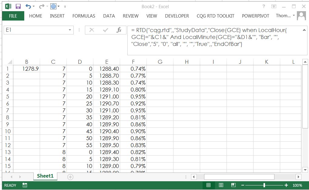
Figure 2: Calling closing data by time.
The RTD call in cell B1 is yesterday’s settlement. Column C displays the hour and column D displays the five-minute time. Column E contains the RTD call for the close of gold every five minutes using the values in columns C and D:
= RTD(“cqg.rtd”,,”StudyData”,”Close(GCE) when LocalHour(GCE)=”&C1&” And LocalMinute(GCE)=”&D1&””, “Bar”, “”, “Close”,”5″, “0”, “all”, “”, “”,”True”,,”EndOfBar”)
Column F calculates the difference between the close of each 5-minute bar and yesterday’s settlement, divided by yesterday’s settlement to return the percent net change:
=(E1-$B$1)/$B$1
Column F is the column displayed on the chart. You repeat this work for each market. However, there is a problem and an Excel tip for a solution.
Further down the column for columns E and F there will not be a close displayed in column E because the market has yet to post trades for that time today. The cell will be blank, but Excel will divide that blank cell by yesterday’s settlement and return the #VALUE error. See Figure 3.
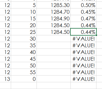
Figure 3: An error occurs when there is no closing price.
The chart will display this as a zero value along the time axis all the way to the right. This creates a poor-looking display.
The Excel tip is to add an additional column and use the IF formula with the ISERROR formula. Then, if there is an error, Excel will display #NA. Here is the Excel formula for cell G1 as shown in Figure 4:
=IF(ISERROR(F1),NA(),F1)
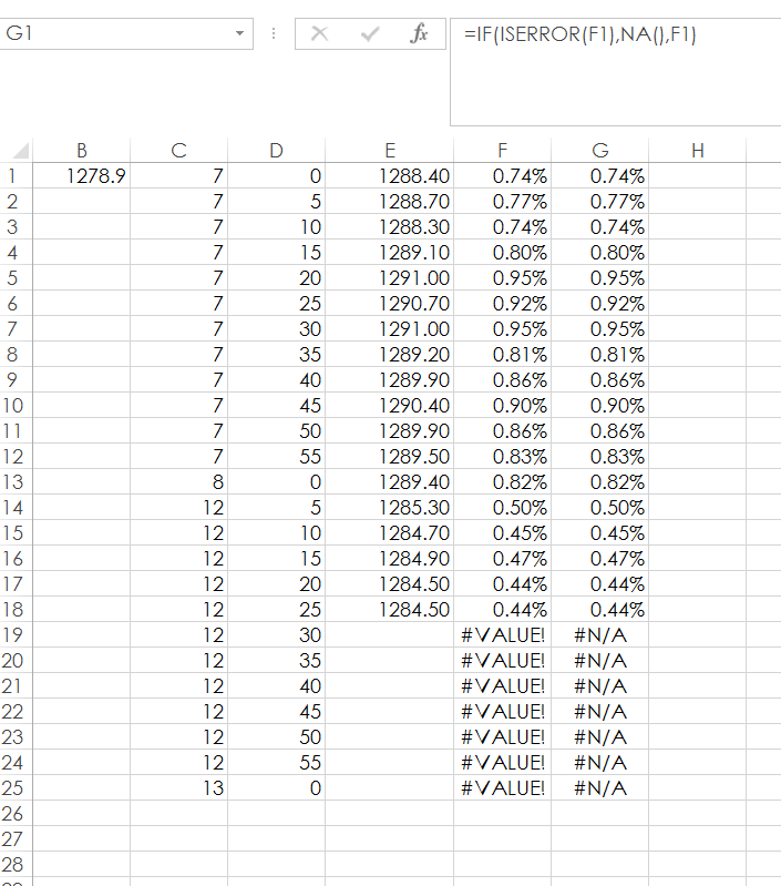
Figure 4: IF and ISERROR Excel formulas used together to resolve the #VALUE error issue.
Use column G for the line chart’s price data. Now, the Excel chart will stop displaying any values when it sees the #NA error. This Excel tip will give your charts a cleaner look.
Conclusion
Excel’s flexibility, along with data visualization techniques and charting, offers the opportunity to build dashboards with real-time market data and studies that are exactly what you want for your work.
Related Reading
Gain An Edge: New Ways To View Data On The Go by Thom Hartle CGQ Inc.

